
Magic Spoon: Why Grown Adults Want to Eat Like Children Again
A case study in nostalgia, emotional regression, and safety through familiarity
Introduction: Optimization Was Exhausting — Comfort Felt Safer
At some point, wellness stopped feeling aspirational.
It became instructional.
Moralized.
Heavy.
Food, especially, turned into a site of vigilance — labels to read, macros to calculate, ingredients to interrogate. Eating well no longer felt like care; it felt like performance.
Magic Spoon didn’t arrive to fix nutrition.
It arrived to fix how health felt.
Its true insight wasn’t dietary.
It was emotional.
The Rejection of Adulthood in Wellness Culture
Magic Spoon begins with a quiet assumption: adulthood is cognitively demanding.
Between decision fatigue, self-surveillance, and constant optimization, being an “informed consumer” started to feel burdensome rather than empowering.
Magic Spoon offered an alternative posture:
Eat like you remember — without consequences.
This is not nostalgia as sentimentality.
It is nostalgia as psychological relief.
What’s important is that this relief was not accidental.

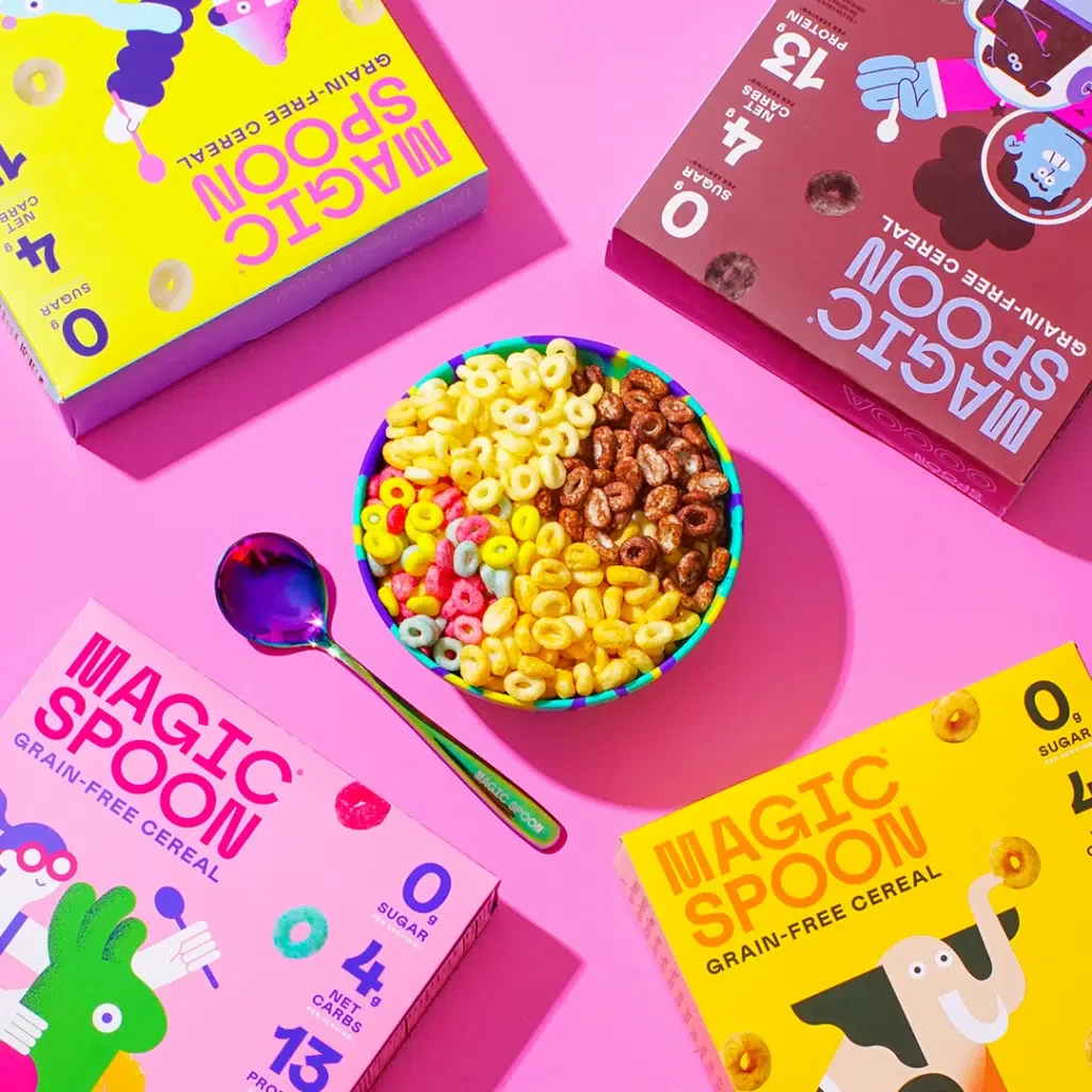
Image Courtesy: The Information
Magic Spoon was founded by Gabi Lewis and Greg Sewitz, former startup operators deeply embedded in modern health culture. They didn’t begin with childhood longing. They began with constraint — asking how to engineer a cereal that met adult nutritional expectations without reproducing the emotional heaviness that usually accompanies them.
Nostalgia came later — not as indulgence, but as a delivery system.
Used deliberately, familiarity softened friction. Play made discipline tolerable. Childhood cues reframed adult compliance.
Magic Spoon wasn’t built as a love letter to the past.
It was built as a solution to optimization fatigue — using memory to make control feel light.
Nostalgia as a Safety Signal
From a psychological perspective, childhood cues function as safety markers.
Bright colors.
Familiar mascots.
Simple flavor metaphors.
They signal a time before:
risk mitigation
moralized consumption
self-criticism
Magic Spoon doesn’t recreate cereal.
It recreates the emotional conditions under which cereal once felt safe.
And then it removes the guilt.
This is emotional regression — not as immaturity, but as rest.
Control Hidden Beneath Play
What makes Magic Spoon effective is not the nostalgia alone — it’s the discipline underneath it.
High protein.
Low sugar.
Macros made legible after desire is activated.
The brand does something sophisticated:
it leads with feeling
follows with reassurance
never reverses the order
Emotional permission comes first.
Justification arrives quietly.
Compare this to brands that demand understanding before enjoyment — Magic Spoon understands that joy is the gate, not the reward.
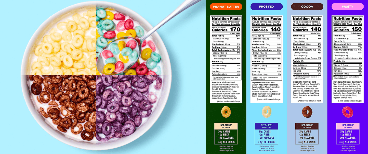
Image Courtesy: Overhaul Fitness
Design as Memory Activation, Not Aesthetic Choice
Magic Spoon’s packaging is not decorative.
It is mnemonic.
Colorways mirror childhood cereal boxes without copying them exactly. Fonts feel friendly but controlled. Mascots are abstracted rather than literal.
This isn’t imitation.
It’s recognition.
The design doesn’t say this is like the cereal you loved.
It says remember how cereal used to make you feel?
That distinction matters.
Recognition activates emotion faster than resemblance.
The Emotional Contract Magic Spoon Offers
Magic Spoon doesn’t ask consumers to be adults about food.
It asks them to be relieved.
It says:
You don’t have to earn comfort
You don’t have to justify pleasure
You don’t have to choose between care and joy
In a culture that trained people to discipline appetite, Magic Spoon reframes indulgence as harmless when structurally controlled.
This is control — but it’s disguised as play.
Why Magic Spoon Worked (When Others Didn’t)
Many brands attempt nostalgia.
Few succeed.
Magic Spoon worked because:
it modernized formulation without modernizing tone
it respected adult anxiety without amplifying it
it didn’t make nostalgia ironic or apologetic
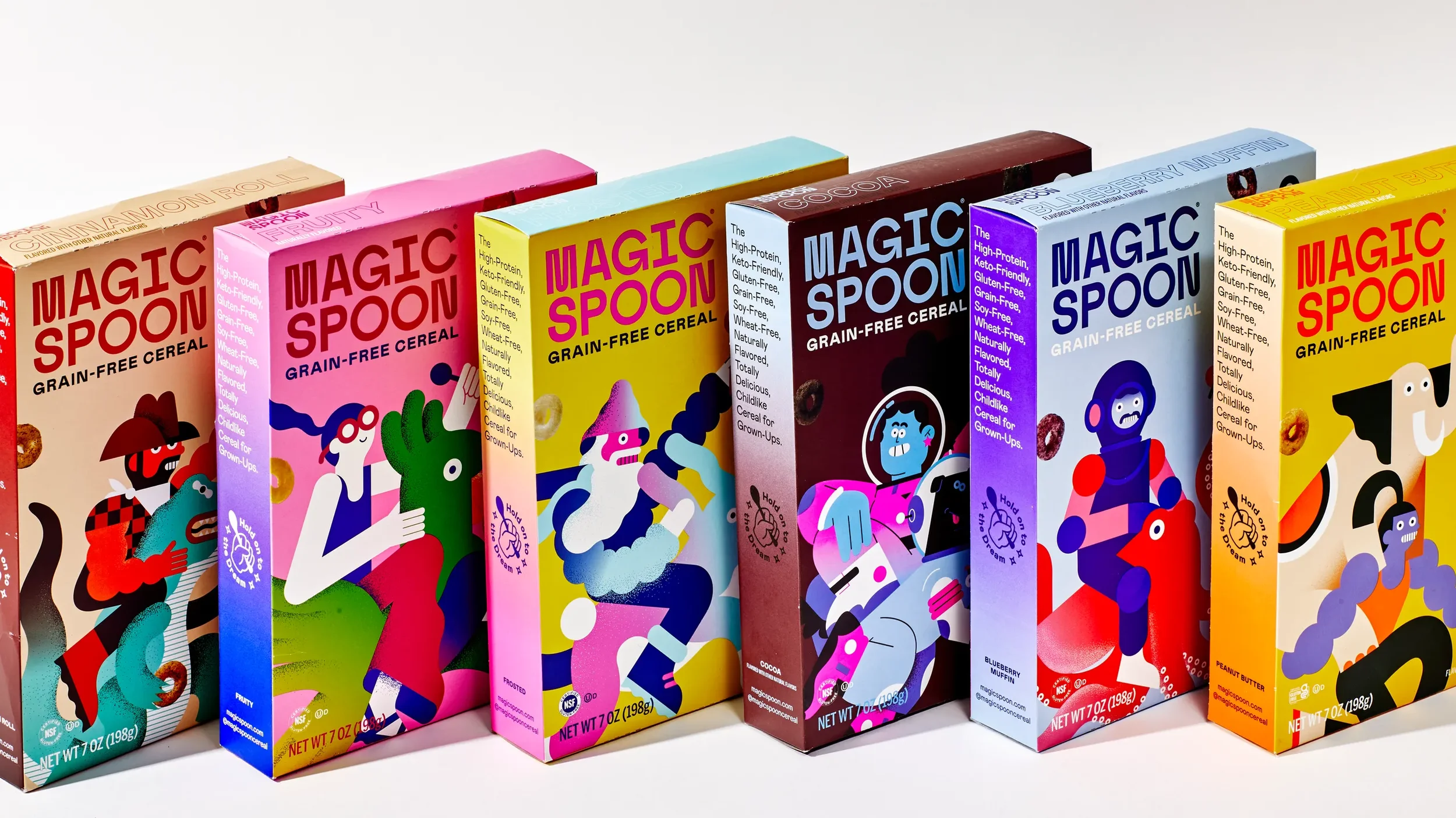
Image Courtesy: Bon Appetit
It understood that people don’t return to childhood memories for aesthetic reasons — they return because those memories feel unthreatening.
Magic Spoon didn’t sell cereal.
It sold emotional truce.
Strategic Takeaways for Brand Builders
Magic Spoon reveals several non-obvious truths:
Nostalgia works when it restores psychological conditions, not visuals
Playfulness can coexist with discipline — if sequencing is right
Emotional permission is often more persuasive than information
Comfort is a form of safety, not weakness
Simplification is emotional before it is functional
Brands don’t have to lighten their product to reduce stress.
They have to lighten the experience of choosing it.
Conclusion: Sometimes Safety Looks Like Play
Magic Spoon succeeds because it understands something many wellness brands forget:
Health is rarely rejected because it’s ineffective.
It’s rejected because it feels emotionally expensive.
Magic Spoon lowers the emotional cost of caring for yourself — not through authority, discipline, or vigilance — but through familiarity.
It gives consumers something most wellness brands never offer:
Care that doesn’t feel like work.
And in a culture exhausted by optimization, that may be the most serious innovation of all.
Essential Reads: Understanding Nostalgia and Emotional Relief
1. Consumed: How Markets Corrupt Children, Infantilize Adults, and Swallow Citizens Whole — Benjamin R. Barber
Why it matters: Explores how childhood cues re-enter adult consumption as emotional refuge rather than regression.
2. The Theory of Cognitive Dissonance — Leon Festinger
Why it matters: Explains how Magic Spoon resolves the tension between desire and self-image.
3. Predictably Irrational — Dan Ariely
Why it matters: Reveals why emotion-led decisions feel more “right” than rational ones.
4. Brand Seduction — Daryl Weber
Why it matters: Shows how subconscious cues like color, familiarity, and tone shape trust and desire.
5. The Experience Economy — Pine & Gilmore
Why it matters: Frames Magic Spoon as an emotional experience, not a food product.
Seed: When Science Became the Source of Calm
A case study in epistemic authority, legitimacy, and modern trust
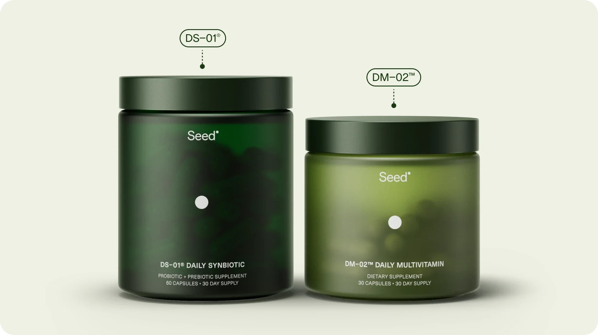
Image courtesy: Seed
Introduction: Wellness Didn’t Need More Hope — It Needed Proof
By the time Seed entered the market, wellness culture was exhausted.
Consumers had tried promises.
They had tried personalization.
They had tried “listen to your body.”
What they lacked wasn’t motivation — it was confidence.
Health decisions had become emotionally loaded, morally charged, and cognitively overwhelming. The question was no longer What should I take? but Who can I trust without second-guessing myself?
Seed did not attempt to make wellness feel easier.
It made it feel serious.
This Seed case study explores how the brand built trust not through relatability, lifestyle aesthetics, or simplification — but through scientific rigor as emotional reassurance.
1. The Cultural Shift: From Self-Care to Self-Audit
Modern wellness quietly turned consumers into regulators.
People learned to:
evaluate ingredients
question sourcing
cross-reference claims
research mechanisms
What looked like empowerment increasingly felt like burden.
Seed recognized this shift clearly. It did not assume misinformation could be countered with warmth or charm. It assumed that consumers wanted epistemic relief — the ability to stop doubting.
In anthropological terms, Seed responded not to desire, but to decision fatigue under uncertainty.
2. The Founders and the Rejection of Simplification
Seed’s founders positioned the brand explicitly against wellness reductionism.
Rather than translating science into lifestyle language, Seed kept it intact. Microbiome complexity wasn’t hidden — it was foregrounded.
This was a decisive move.
Seed refused to reassure consumers by making science sound easy. Instead, it reassured them by signaling that difficulty was being taken seriously.
Trust did not come from friendliness.
It came from respect for complexity.
3. Science as Emotional Architecture
Seed’s greatest strategic insight is that science functions emotionally long before it functions rationally.
Peer-reviewed research, academic partnerships, and clinical framing don’t just inform — they stabilize.
They tell the consumer:
This decision does not rely on belief.
That assurance reduces anxiety not by eliminating uncertainty, but by transferring responsibility back to an authority capable of holding it.
In this way, Seed offers something rare in wellness culture:
permission to stop managing everything yourself.
4. Design That Signals Credibility, Not Comfort
Seed’s visual identity is intentionally stark.
Monochrome palette.
Clinical typography.
Minimal visual distraction.
This is not aesthetic coldness.
It is epistemic signaling.
The design communicates:
seriousness
containment
boundaries
There is no invitation to self-expression here. No mood. No lifestyle promise.
The aesthetic says:
This product exists to work, not to perform.
5. Trust Without Intimacy
Many wellness brands rely on intimacy to build loyalty.
Seed does not.
It does not ask to be part of a ritual, a morning routine, or a self-care moment. It does not encourage storytelling or emotional projection.
Instead, Seed builds trust by withholding personality.
This restraint matters.
In psychology, trust increases when authority is paired with predictability — not warmth. Seed’s consistency reduces interpretive load. The brand behaves the same way at every touchpoint.
That predictability is calming.
6. Sustainability as Structural Integrity
Seed’s commitment to sustainability reinforces its epistemic positioning.
Packaging systems, refill programs, and transparency around materials are not framed emotionally. They are framed operationally.
This strengthens trust because:
values are executed, not advertised
ethics are embedded, not narrated
The brand’s seriousness is not selective.
Consistency across domains reinforces credibility.
7. Strategic Takeaways for Brand Builders
Seed reveals a lesson many brands resist:
Not all consumers want warmth
Not all products benefit from simplification
Complexity can be reassuring when held responsibly
Authority reduces anxiety when it is legible and consistent
Trust grows when brands refuse to over-perform emotionally
Seed does not meet the consumer halfway.
It asks them to step out of subjectivity altogether.
Conclusion: Calm Through Certainty
Seed’s success is not about probiotics.
It is about restoring a feeling that wellness culture eroded:
confidence without vigilance.
In a market that trained consumers to audit everything, Seed offered a counter-contract:
You don’t need to understand all of this. You need to trust that we do.
That trust is not cultivated through charm or community.
It is earned through rigor, restraint, and coherence.
Seed proves that authority — when genuinely held — can be profoundly calming.
Essential Reads: Understanding Seed’s Epistemic Authority
1. Trust in Numbers — Theodore M. Porter
Why it matters: Explains why quantified science becomes a source of legitimacy when personal judgment feels insufficient.
2. The Structure of Scientific Revolutions — Thomas Kuhn
Why it matters: Reveals how frameworks, not facts alone, determine what people accept as “true.”
3. Risk Society — Ulrich Beck
Why it matters: Contextualizes why modern consumers seek expert systems to manage invisible risks.
4. Thinking, Fast and Slow — Daniel Kahneman
Why it matters: Explains why cognitive ease, not knowledge, determines trust under uncertainty.
5. Brand Seduction — Daryl Weber
Why it matters: Highlights how seriousness and consistency influence subconscious trust formation.
SKIMS: How Control Replaced Body Positivity
A cultural case study in power, visibility, and strategic permission
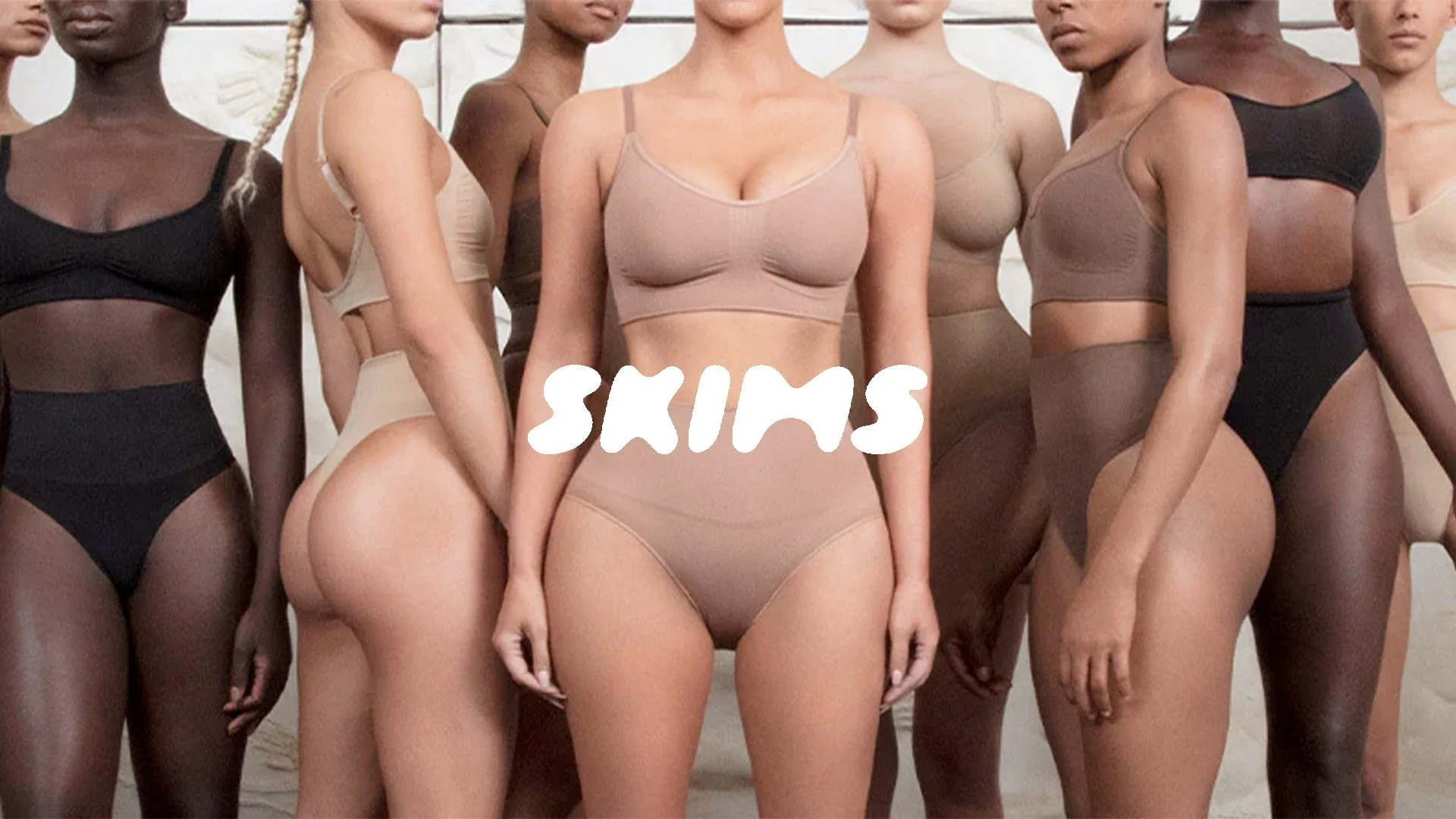
Image Courtesy: Soar With Us
Introduction: Body Positivity Didn’t Remove the Gaze
Body positivity promised freedom.
What it delivered was visibility — without protection.
As bodies became more present across digital spaces, scrutiny intensified. The call to “love your body” arrived alongside relentless comparison, documentation, and judgment.
SKIMS entered not to challenge visibility, but to restructure power within it.
This SKIMS case study examines how the brand reframed self-acceptance away from affirmation and toward control — and why that shift resonated where positivity alone stalled.
Visibility Is Power Only If It’s Negotiable
Modern culture insists on being seen — but rarely addresses the cost.
Anthropologically, visibility without agency creates exposure, not empowerment. The body becomes legible, searchable, discussable — yet insufficiently protected.
SKIMS did not attempt to liberate women from the gaze.
It gave them tools to negotiate it.
This repositioned shapewear from apology to authorship.
Shapewear Reframed: From Correction to Command

Historically, shapewear functioned defensively — designed to erase parts of the body deemed unacceptable.
SKIMS inverted that logic.
The product is not about concealment, but intentional containment. Not hiding the body, but deciding how it presents, how it feels, how it moves.
Behaviorally, perceived control reduces anxiety. Confidence follows mastery, not denial. SKIMS understood that empowerment is less about rejecting standards than managing their impact.
This was not liberation through refusal.
It was agency through precision.
Kim Kardashian and Epistemic Credibility

Image Courtesy: ABC News
Kim Kardashian’s role is often dismissed as celebrity leverage. That reading misses the point.
Her body has existed under sustained cultural surveillance — idealized, criticized, dissected — for years. She does not represent fantasy. She represents endurance under exposure.
That history matters.
When SKIMS positions support, compression, and fit as comfort rather than concealment, it carries credibility. Kim is not selling aspiration. She is selling lived fluency in visibility.
This is epistemic authority — not fame.
Design as Infrastructure, Not Expression
SKIMS’ visual identity is neutral by design.
Muted tones. Skin-spectrum palettes. Minimal ornamentation.
This is not aesthetic restraint. It is infrastructural thinking.
The brand does not decorate the body. It integrates into it. Design steps back so function can lead — repositioning shapewear as support rather than spectacle.
The body remains the protagonist.
The product enables quietly.
Inclusivity as Engineering, Not Messaging

Image Courtesy: WWD
SKIMS’ inclusivity is operational, not rhetorical.
Extended sizing, realistic shade ranges, and consistent fit logic signal seriousness. Inclusivity here is not a moral claim — it is system design.
This matters because competence builds trust faster than ideology. SKIMS does not ask to be believed. It proves capacity through execution.
Inclusivity becomes infrastructure.
Strategic Takeaways for Brand Builders
SKIMS’ marketing strategy reveals uncomfortable truths:
Affirmation alone does not restore agency
Control and self-acceptance are not opposites
Visibility requires protection to feel empowering
Inclusivity must be built, not announced
Utility outlasts symbolism in cultural debates
SKIMS does not promise freedom from judgment.
It gives leverage within it.
Conclusion: Control Was the Missing Language
SKIMS didn’t solve body image.
It changed the terms of engagement.
By reframing support as strength and containment as choice, the brand offered something more durable than positivity: strategic sovereignty.
In a culture obsessed with being seen, SKIMS gave women a quieter, more powerful option —
the ability to decide how they appear.
That decision, not celebration, is what endures.
Essential Reads: Understanding SKIMS’ Power Lens
1. Discipline and Punish — Michel Foucault
Why it matters: Examines how bodies are regulated, observed, and shaped within systems of power.
2. The Managed Heart — Arlie Hochschild
Why it matters: Connects bodily presentation, emotional labor, and control.
3. The Beauty Myth — Naomi Wolf
Why it matters: Provides historical context for why shapewear carried stigma — and why reframing it required precision.
4. Brand Seduction — Daryl Weber
Why it matters: Explains how comfort, familiarity, and tactile reassurance drive trust.
5. Influence — Robert Cialdini
Why it matters: Grounds normalization and social proof without reducing them to tactics.
Salt & Stone: Why Grounded Brands Win in an Anxious Wellness Market
A case study in stability, embodiment, and meaning reframing
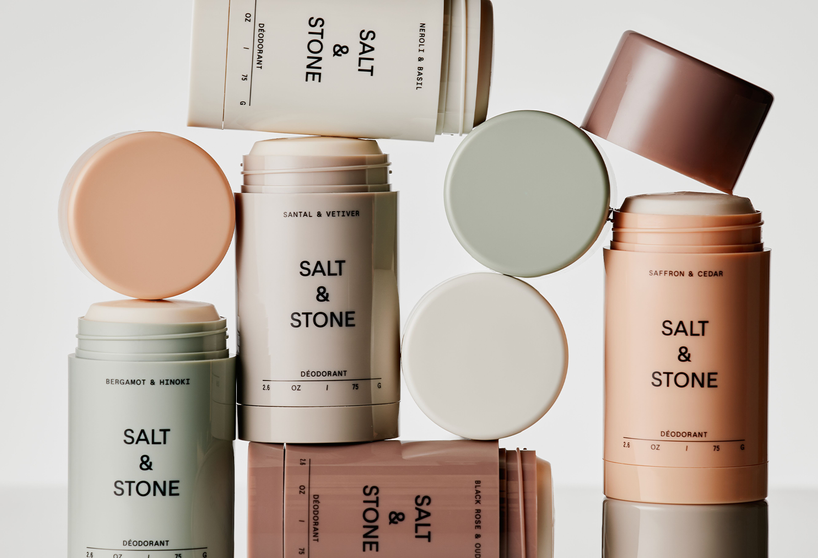
Image Courtesy: BeautyMatter
Introduction: Clean Was Loud — Salt & Stone Was Quiet
By the time Salt & Stone entered body care, the category was already saturated.
Aluminum-free deodorants weren’t novel.
“Clean” formulations weren’t differentiated.
Ingredient fear had been thoroughly communicated.
Functionally, Salt & Stone was late.
Emotionally, it arrived at the exact right moment.
Rather than amplifying concern about what the body absorbs, Salt & Stone reframed the question entirely:
What if care didn’t need vigilance at all?
This Salt & Stone brand case study explores how the brand succeeded not by educating consumers more — but by removing anxiety from the daily act of care.
The Failure of Early Clean Brands: Fear Without Resolution
Most early natural deodorant brands shared the same narrative structure:
Conventional deodorant is dangerous
The body is under threat
Switching products is an ethical act
While well-intentioned, this framing produced three psychological costs:
Chronic vigilance — consumers felt responsible for monitoring risk daily
Identity pressure — using the product meant adopting a moral position
Aesthetic compromise — products often looked apologetic or utilitarian
The category trained consumers to feel good only when being careful — which is emotionally unsustainable for something used every day.
Salt & Stone did something rare.
It opted out.
A Different Emotional Contract: Resilience, Not Risk
Salt & Stone does not define the body as fragile.
It defines it as exposed — to heat, sweat, movement, friction, environment.
This distinction matters.
Instead of protecting the body from imagined threats, the brand frames care as maintenance under real conditions.
No panic.
No alarm.
No lists of what to avoid.
Just durability.
From a psychological standpoint, Salt & Stone shifts body care from threat mitigation to environmental readiness.
That reframing changes everything.

Image Courtesy: WWD
Founder Context: Equipment, Not Ideology
Salt & Stone was founded by Nima Jalali, a former professional snowboarder whose experience came not from wellness culture but from constant physical exposure — sun, cold, sweat, salt, friction.
That origin matters because it shaped the brand’s logic.
Jalali didn’t translate fear into product.
He translated use.
Care, in this system, isn’t preventive virtue. It’s something that needs to hold up under pressure.
Importantly, Salt & Stone does not center its founder narratively. His worldview is absorbed into materials, formulations, and tone — not storytelling.
The result is a brand that feels more like equipment than identity.
Design as Proof of Stability
Salt & Stone’s design doesn’t decorate the product. It anchors it.
muted palettes
heavy packaging
matte finishes
minimal typography
These choices signal permanence.
In consumer psychology, weight, resistance, and restraint communicate trust because they imply:
longevity
seriousness
non-trend dependence
Salt & Stone looks like it belongs wherever the body moves — beach, gym, travel, bathroom — not just on a shelf or feed.
Design here is not aesthetic pressure.
It is physical reassurance.

Image Courtesy: SaltandStone
Why Salt & Stone Didn’t Need a “Suspicious List”
This is where Salt & Stone diverges most clearly from brands like Drunk Elephant.
Drunk Elephant used fear strategically — but critically, it bounded that fear through the “Suspicious 6,” offering resolution through knowledge.
Salt & Stone rejected that model entirely.
Why?
Because its emotional job wasn’t control — it was grounding.
Where Drunk Elephant calms anxiety by structuring vigilance, Salt & Stone calms it by removing cognitive demand altogether.
The body isn’t something to monitor.
It’s something to trust.
The brand succeeds because it never activates the nervous system in the first place.
Scent and Texture as Regulators, Not Stimuli
Salt & Stone’s fragrances do not perform emotional highs.
Notes like vetiver, eucalyptus, santal, and bergamot stay spatial, close to the skin, and restrained.
In sensory psychology, such scents:
reduce mental chatter
encourage presence
feel stabilizing rather than expressive
The product doesn’t energize or soothe dramatically.
It holds the baseline.
This is care designed to disappear into routine — which is precisely why it sticks.
Why Salt & Stone Scaled When Others Didn’t
Salt & Stone made aluminum-free feel inevitable rather than ideological.
It succeeded because:
it removed fear from the equation
it avoided moralizing the user
it invested in brand world, not escalation of claims
it allowed consumers to choose better care without adopting a new identity
That neutrality is its power.
In a culture saturated with messages about being better, Salt & Stone simply asked consumers to be steady.
Strategic Takeaways for Brand Builders
Salt & Stone reveals several truths worth internalizing:
Fear works only when tightly bounded — and often not at all in daily rituals
Products used every day must reduce, not increase, cognitive load
Embodied trust can outperform educational persuasion
Founder influence can be absorbed without founder visibility
Calm is a competitive advantage in anxious categories
Sometimes what differentiates a brand isn’t what it argues — but what it refuses to activate.
Conclusion: Care That Doesn’t Ask Questions
Salt & Stone didn’t win because it was cleaner.
It won because it made caring for the body feel non-negotiable, non-performative, and non-stressful.
In a market that taught consumers to think harder about their bodies, Salt & Stone let them stop thinking — and start trusting again.
It’s not a brand about purity.
It’s a brand about remaining intact.
And in today’s wellness landscape, that may be the most radical position of all.
Essential Reads: Understanding Grounded Trust
1. Risk Society — Ulrich Beck
Why it matters: Explains why modern consumers seek relief from constant risk assessment.
2. The Body Keeps the Score — Bessel van der Kolk
Why it matters: Grounding and safety are somatic, not cognitive.
3. Sensuous Scholarship — Paul Stoller
Why it matters: Illuminates how sensory experience builds meaning and belief.
4. Brand Seduction — Daryl Weber
Why it matters: Shows how material cues shape subconscious trust.
5. Ways of Seeing — John Berger
Why it matters: Offers insight into how material restraint alters perception.
OSEA: How Purity Became a Feeling, Not a Claim
A cultural case study in release, inheritance, and quiet trust
Image Courtesy: OSEA Malibu
Introduction: Clean Beauty Made People Anxious
Clean beauty was supposed to simplify care.
Instead, it taught vigilance.
Ingredient audits. Red lists. Suspicion framed as responsibility.
Purity became something you had to earn through constant monitoring.
OSEA entered with a different posture.
It did not ask consumers to be alert.
It asked them to let go.
This OSEA case study explores how the brand reframed purity away from fear and toward felt cleanliness — and why that shift created a rare sense of trust in an exhausted wellness culture.
Founding Story: Inheritance Without Nostalgia
OSEA was founded by Jenefer Palmer and her daughter, Melissa Palmer, rooted in a shared commitment to holistic health and the healing intelligence of the ocean.
Long before wellness became aspirational or marketable, the Palmers’ relationship to care was lived, intergenerational, and practiced — not performed.

Image Courtesy: OSEA Malibu
But OSEA doesn’t lead with ideology.
It leads with lineage.
This isn’t nostalgia for the past — it’s continuity across time.
Anthropologically, brands rooted in inheritance signal inevitability. They don’t feel invented to solve a trend. They feel carried forward.
OSEA’s story isn’t framed as disruption.
It’s framed as return.
That matters — because trust forms faster around things that feel remembered rather than engineered.
The Core Reframe: Purity Without Vigilance
Most clean brands activate a familiar loop:
If you don’t choose carefully, harm will follow.
OSEA refused that narrative.
It did not moralize decisions or elevate scrutiny.
Instead, it anchored purity in the environment itself — the ocean as a source that cleans by nature, not by effort.
This is a critical brand shift.
OSEA does not make the consumer responsible for purity.
It makes purity ambient.
You don’t manage it.
You receive it.
Psychologically, this removes friction at the point of care — replacing anxiety with surrender.
Anthropologically, purity has always been less about chemistry and more about emotional order — about what feels safe to let inside.

Image Courtesy: ISSUU
Psychological Trigger: Release as Safety
Where many wellness brands activate alertness, OSEA activates parasympathetic calm.
The ocean is not framed as effective because it fights.
It’s effective because it washes.
This matters because safety is not always about control. Sometimes it’s about permission to stop controlling.
From a nervous-system perspective, OSEA is a brand that lowers cognitive load.
There are no lists to remember.
No rules to internalize.
No “right way” to perform wellness.
Cleanliness becomes a felt state, not a cognitive outcome.
Design as Emotional Evidence
OSEA’s visual language avoids sharp contrast, typography asserts nothing, and packaging feels light rather than declarative.
This is intentional.
Design here performs psychological work:
Soft blues and whites evoke vastness and continuity
Glass packaging suggests recyclability without preaching sustainability
Minimal copy keeps the body centered, not the instruction
The design does not prove purity.
It feels pure.
In emotional branding terms, this is pre-verbal trust formation — the body believes before the mind evaluates.
Community Without Performance
OSEA’s marketing avoids lifestyle extremity.
There is no hyper-optimization.
No aspirational exhaustion.
No curated discipline.
Instead, the brand is associated with softness, recovery, and repetition.
This subtly signals a different ideal consumer identity:
Not the “best” version of yourself.
But the cleaned one.
OSEA customers are not trying to win wellness.
They are trying to come back to themselves.
That shared emotional posture forms a quiet community — one based on relief, not achievement.
Strategic Takeaways for Brand Builders
OSEA offers several quiet but powerful lessons:
Purity does not require fear to be credible
Trust forms faster through inheritance than innovation
Design can regulate emotion without messaging
Fewer claims can increase belief
Wellness doesn’t need tasks — it needs permission
OSEA succeeds because it removes pressure rather than adding instruction.
Conclusion: When Cleanliness Stops Demanding Proof
OSEA didn’t redefine clean beauty by doing more.
It did so by doing less — and doing it consistently.
By removing vigilance from purity, and ideology from care, OSEA transformed skincare into a moment of release rather than responsibility.
In a culture trained to monitor itself constantly, OSEA offered a radical alternative:
You are already clean enough to rest.
That emotional truth — not seaweed, not formulas — is what endures.
Essential Reads: Understanding OSEA’s Emotional Architecture
Brand Seduction — Daryl Weber
Why it matters: Explains how calm, sensory cues generate trust before rational evaluation — central to OSEA’s influence.The Senses Still — Benjamin Stegner
Why it matters: Explores embodied perception and how environments shape emotional meaning — foundational to oceanic branding.Purity and Danger — Mary Douglas
Why it matters: A classic anthropological text on how cultures define cleanliness and contamination — directly relevant to OSEA’s reframing of purity.The Experience Economy — Pine & Gilmore
Why it matters: Contextualizes how OSEA creates a state, not merely a product — transforming skincare into an experience of release.Thinking, Fast and Slow — Daniel Kahneman
Why it matters: Helps explain why reducing cognitive load increases trust — a core mechanism behind OSEA’s appeal.
Drunk Elephant vs Tatcha: Two Ways of Caring for the Same Fear
A psychological and anthropological contrast in modern self-care
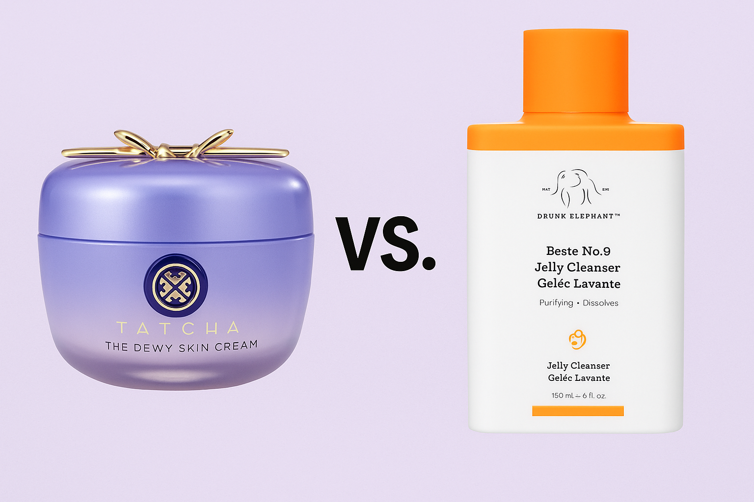
Introduction: The Anxiety Came First
Before either brand existed, the anxiety did.
Modern consumers did not wake up one day wanting serums, rituals, or ingredient philosophies. They woke up feeling uncertain inside their own bodies — unsure what was safe, unsure who to trust, unsure where responsibility lay.
Wellness culture did not create this anxiety.
It inherited it.
Drunk Elephant and Tatcha emerged as responses to the same underlying condition: bodily uncertainty in a culture obsessed with optimization. But where they diverge — radically — is in what they believe care should look like once fear is present.
This is not a comparison of products or performance.
It is a contrast between two belief systems about the human body.
One Fear, Two Philosophies of Care
At their core, both brands answer the same question:
What should a person do when they feel their body is at risk?
Their answers could not be more different.
Drunk Elephant responds with control.
Tatcha responds with discipline.
Both are forms of care.
Both are emotionally valid.
Neither is neutral.
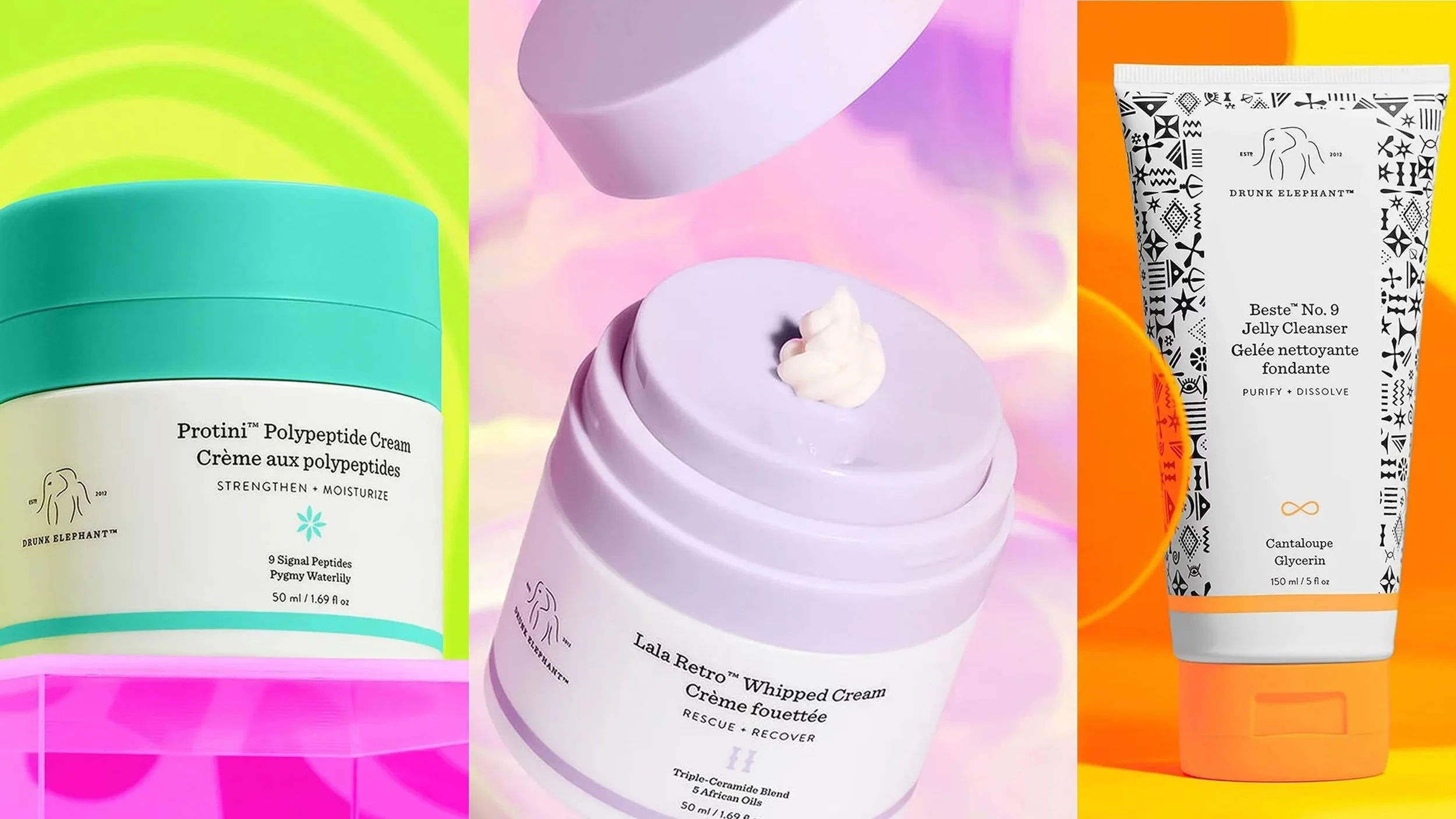
Image Courtesy: ABC News
Drunk Elephant: Care as Control
Drunk Elephant begins from the assumption that the body is exposed.
Harmed by hidden ingredients.
Overwhelmed by misinformation.
Failed by institutions that once promised safety.
In this worldview, care is inseparable from vigilance.
The brand’s defining contribution — the “Suspicious 6” — did something psychologically powerful: it made danger listable. Finite. Comprehensible. Suddenly, fear had boundaries.
This is classic risk-management behavior. Anxiety does not disappear; it becomes manageable through rules.
Drunk Elephant doesn’t ask consumers to trust a system.
It asks them to become the system.
Mix your products.
Read the labels.
Stay alert.
Care here is active, cognitive, and ongoing. Relief comes not from surrender, but from competence.

Image Courtesy: Business Insider
Tatcha: Care as Discipline
Tatcha begins from a very different assumption: that the body is not fragile by default — but destabilized by impatience.
Its philosophy was shaped through translation, not invention. Founder Victoria Tsai, encountering Japanese beauty practices during a period of physical and emotional depletion, did not find urgency or correction. She found maintenance.
Care, in this system, is not about detecting threats.
It is about repeating what sustains.
Ritual matters not because it is beautiful, but because it creates rhythm. Discipline is not restrictive; it is stabilizing.
Tatcha does not educate consumers into alertness.
It asks them to wait.
Trust builds over time.
Results are cumulative.
The body is allowed to adapt.
Care here is slow, embodied, and longitudinal.
Time as the Hidden Differentiator
The deepest contrast between these brands is not ingredient philosophy — it is time orientation.
Drunk Elephant compresses time.
Safety should be immediate. Clarity should be instant. If harm exists, remove it now.Tatcha expands time.
Care unfolds slowly. Trust accrues through continuity. The body learns through repetition.
Time is not a backdrop.
It is a design choice.
Each brand teaches customers how long care should take — and what kind of patience (or urgency) is appropriate.
Founder Authority: Defense vs Translation
Both brands are founder-led, but the nature of authority differs fundamentally.
Tiffany Masterson (Drunk Elephant) derives authority from personal harm. Her stance is protective, defensive, and corrective. She does not claim expertise through tradition, but through lived exposure.
Victoria Tsai (Tatcha) derives authority through humility. She positions herself as a translator of a system older and more disciplined than herself — one she learned from by slowing down.
One founder says: I discovered what to avoid.
The other says: I learned what to repeat.
Neither is more authentic.
But they encode different relationships to fear.
Design as Psychological Instruction
Design, in both brands, teaches the nervous system what to do.
Drunk Elephant’s bright colors, bold typography, and category differentiation function as signals of alertness. The shelf presence says: pay attention.
Tatcha’s muted palettes, ceremonial packaging, and visual restraint create pause. The design says: slow down.
This is not aesthetic preference.
It is nervous-system choreography.
One design activates.
The other regulates.
What Each Brand Asks of the Consumer
This is where the contrast becomes personal.
Drunk Elephant asks you to:
Learn continuously
Monitor actively
Make frequent decisions
Carry responsibility
Tatcha asks you to:
Commit
Repeat
Trust process
Relinquish immediacy
Both demand effort.
But of entirely different kinds.
One rewards mastery.
The other rewards patience.
The Uncomfortable Truth
Here is the tension neither brand can escape:
Control empowers — but transfers burden to the individual.
Discipline calms — but requires surrender to time.
Neither path is purely liberating.
Drunk Elephant offers relief without rest.
Tatcha offers calm without guarantees.
The success of both brands reveals something deeper about modern wellness culture: there is no singular way to feel safe in one’s body anymore.
Why Both Brands Succeeded
They succeeded because they were coherent.
They did not blend philosophies.
They did not hedge their beliefs.
They did not try to soothe and activate simultaneously.
Each brand respected the psychology it invoked.
That clarity — even when divisive — builds trust.
Conclusion: Care Is Never Just Product
Drunk Elephant and Tatcha are not selling skincare.
They are selling frameworks for managing uncertainty.
One says: Stay informed. Stay in control.
The other says: Slow down. Stay consistent.
Neither answer the fear completely.
But each gives it form.
And in a culture where bodies feel increasingly unstable, form — not perfection — is often what people are really buying.
Tatcha: When Ritual Was Translated, Not Marketed
A cultural case study in discipline, reverence, and quiet authority

Image Courtesy: Sephora
Introduction: Most Rituals Are Stripped Before They Are Sold
Western wellness brands love the idea of ritual.
Few respect the requirements of translating one.
Ritual is not repetition.
It is not aesthetic.
It is not mood.
Ritual is discipline sustained across time.
Most brands extract the look of ritual while discarding its demands. They flatten meaning for accessibility. They turn practice into performance.
Tatcha is rare because it did not extract.
It translated.
This Tatcha case study explores how founder Victoria Tsai preserved the discipline of Japanese beauty rituals while making them legible to a Western consumer—and why that restraint built a brand capable of longevity, trust, and eventual acquisition.
Victoria Tsai and the Conditions That Shape Ritual
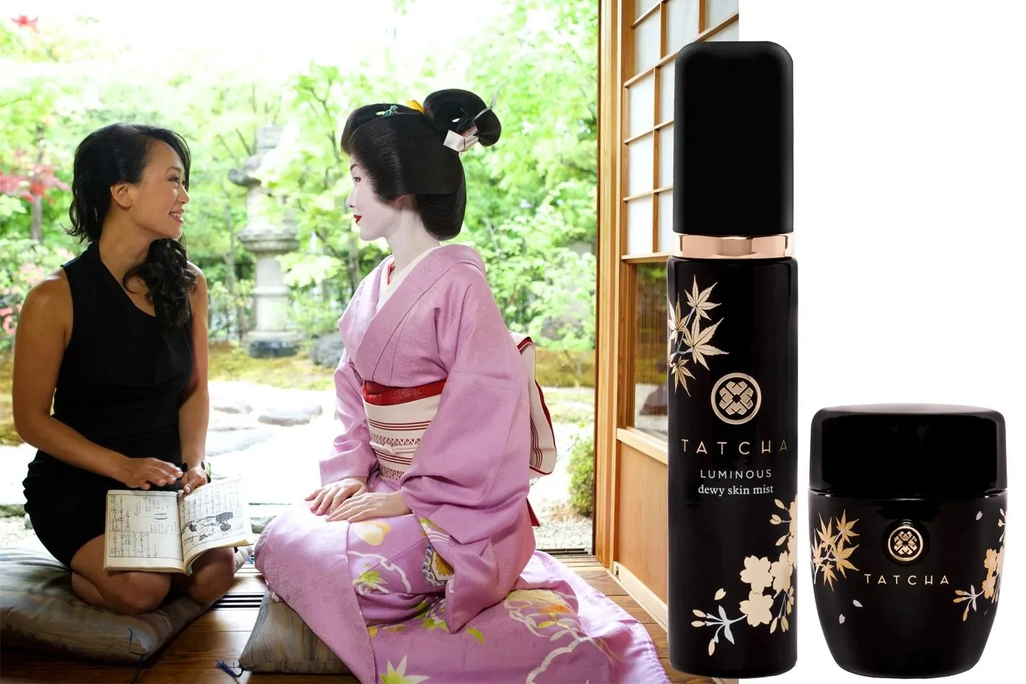
Image Courtesy: Vanity Fair
Tatcha did not begin as a brand exercise.
It began as a condition of necessity.
After losing her job and returning to her parents’ home, Victoria Tsai found herself physically compromised and emotionally depleted. Recovery did not come through acceleration or reinvention. It came through deceleration.
During a trip to Japan, Tsai encountered a philosophy of beauty rooted not in correction, but maintenance. Care was slow, cumulative, and disciplined. Skin was not treated as a problem to solve, but as something to tend to over time.
This distinction matters.
Tatcha was not born out of ambition.
It was born out of a relearning — how to care for the body without urgency, and without extraction.
That origin shaped the brand’s cadence, its restraint, and its refusal to over-promise. The brand’s discipline is not aesthetic. It is autobiographical.
From Appropriation to Translation
Japanese beauty culture is often aestheticized in Western markets—reduced to textures, ingredients, and minimalism.
Tatcha avoided this trap by translating structure, not surface.
Practices like:
gentle exfoliation instead of aggressive correction
layering instead of stripping
prevention over urgency
were presented not as exotic discoveries, but as systems of care with internal logic.
Anthropologically, this matters because rituals lose meaning when detached from discipline. Tatcha preserved rhythm. It preserved sequence. It preserved restraint.
Nothing was rushed.
Nothing was optimized for trend.
That is why it felt credible.
Discipline as Brand Signal
Tatcha’s most powerful brand signal is not luxury.
It is self-restraint.
Product launches are paced deliberately. Formulations evolve slowly. Claims are measured. Language is calm.
This communicates something subtle but important:
This brand is not reacting.
It is maintaining.
In cultural terms, maintenance signals authority. Only systems that expect to endure behave this way.
Tatcha does not sell urgency.
It sells continuity.

Image Courtesy: WWD
Design That Refuses Noise
Tatcha’s visual identity is refined but never loud.
The color story draws from classical Japanese palettes without mimicry. Typography is elegant but non-dominant. Packaging feels ceremonial, not promotional.
Design here functions as framing, not expression.
It creates the psychological cue:
Slow down. Pay attention. Proceed with care.
In a market crowded with stimulation, Tatcha used withdrawal as signal.
Silence became luxury.
Ritual Without Intimacy Extraction
A critical risk in ritual-based branding is emotional extraction—asking consumers to invest meaning without structural return.
Tatcha avoids this by positioning ritual as private discipline, not communal performance.
There is no pressure to share.
No accelerated “transformational journey.”
No before-and-after theater.
The ritual belongs to the user — not the brand.
That boundary preserves trust.
The Acquisition Was Not the Point — But It Was the Proof
When Tatcha was acquired by Unilever, it signaled something important.
Not that heritage could be scaled — but that discipline could be protected.
Tatcha was acquired because it had structure.
Because it was coherent.
Because it could be stewarded without dilution.
That kind of acquisition is not predatory.
It is curatorial.
And only brands built on restraint earn it.
Strategic Takeaways for Brand Builders
Tatcha teaches lessons that are uncomfortable in modern marketing:
Ritual cannot be rushed
Heritage must be translated, not aestheticized
Discipline communicates authority more than aspiration
Silence can outperform stimulation
Longevity attracts capital more reliably than hype
Tatcha did not build desire by escalating promise.
It built trust by lowering volume.
Conclusion: The Brands That Endure Are the Ones That Withstand Speed
Tatcha’s success lies not in storytelling, but in structure that resists acceleration.
It proves that beauty brands do not need to shout to scale — but they must know when not to move.
In a market addicted to momentum, Tatcha stood still long enough to be believed.
That is not nostalgia.
It is discipline, translated correctly.
Essential Reads: Understanding Tatcha’s Ritual Intelligence
1. The Book of Tea — Kakuzō Okakura
Why: Explains ritual, beauty, and discipline as systems of attention — foundational to Tatcha’s philosophy.
2. The Practice of Everyday Life — Michel de Certeau
Why: Frames ritual as lived practice, not symbolic consumption.
3. In Praise of Shadows — Jun'ichirō Tanizaki
Why: Illuminates the cultural value of restraint, subtlety, and quiet authority in Japanese aesthetics.
4. How Brands Grow — Byron Sharp
Why: Explains why consistency and mental availability, not constant novelty, sustain growth.
5. Zen and the Art of Maintenance — Matthew B. Crawford
Why: Reinforces the power of care, repetition, and discipline over optimization.
Drunk Elephant: When Control Became the Language of Care
A cultural case study in fear, agency, and modern wellness psychology

Image Courtesy: Allure
Introduction: Clean Beauty Didn’t Calm People Down — It Activated Them
Drunk Elephant didn’t enter the beauty market to soothe.
It entered at a moment when consumers no longer trusted skincare, brands, or institutions to keep them safe. Ingredient literacy was rising alongside misinformation. Every label became a threat map. Every reaction carried moral weight.
The beauty industry promised purity.
But what it delivered was hyper-vigilance.
Drunk Elephant did not resist this anxiety.
It organized it.
This Drunk Elephant case study explores how the brand converted fear into agency, vigilance into competence, and choice into a feeling of control — and why that model resonated so deeply in a culture trained to mistrust what touches the body.
The Cultural Context: Wellness as Risk Management
By the mid-2010s, skincare stopped being cosmetic.
It became forensic.
Consumers were no longer asking, Will this make my skin better?
They were asking, Could this harm me?
Online communities deconstructed formulas. “Clean” became a moral category rather than a functional one. Trust shifted away from expertise and toward self-education.
Anthropologically, this marks a shift from care to risk management.
Drunk Elephant was built for this era.
Tiffany Masterson and Defensive Authority

Image Courtesy: Beauty Magazine of Malaysia
Drunk Elephant’s founder, Tiffany Masterson, did not position herself as a beauty expert. She positioned herself as a protector.
Her authority emerged from her own adverse skin reactions — from harm experienced, not beauty desired. That origin story matters.
This wasn’t aspiration.
It was defense.
From the beginning, Drunk Elephant framed skincare as a space contaminated by hidden dangers. The brand’s credibility came from identifying threats, naming enemies, and offering clear boundaries.
Masterson didn’t promise transformation.
She promised safety through removal.
The “Suspicious 6”: Fear Given Structure
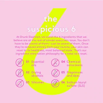
Image Courtesy: Sephora
Drunk Elephant’s most powerful branding device was not formulation — it was categorization.
By naming the “Suspicious 6,” the brand gave consumers something rare:
a finite list of things to avoid.
Psychologically, this is crucial.
Anxiety decreases not when risk disappears, but when it becomes enumerable. The “Suspicious 6” transformed an overwhelming ingredient landscape into a navigable system.
Fear became legible.
Choice became competence.
Drunk Elephant didn’t just offer products — it offered instructional clarity.
Mixing Culture and the Illusion of Mastery
Drunk Elephant’s encouragement to mix products wasn’t about creativity. It was about ownership.
Mixing allowed consumers to feel:
informed
in control
actively protective
This taps into a deeper behavioral truth: agency reduces fear more effectively than reassurance.
Where brands like Tatcha ask consumers to trust sequence and ritual, Drunk Elephant asks them to assemble safety themselves.
The consumer becomes the system.
That feels empowering — and burdensome — at the same time.
Design as Alarm System

Image Courtesy: Pinterest
Drunk Elephant’s packaging is loud, graphic, and unambiguous.
Bright colors. Bold typography. Clear differentiation.
This is not playful whimsy. It is alert design.
In cognitive psychology, high-contrast visuals signal importance and urgency. Drunk Elephant’s aesthetic reinforces attentiveness rather than relaxation.
The shelf presence says:
Pay attention.
Read closely.
Act deliberately.
The design supports the brand’s core psychological posture: vigilance.
Clean Beauty’s Unspoken Cost
Drunk Elephant delivered relief — but not rest.
By training consumers to scrutinize ingredients constantly, the brand elevated competence while sustaining alertness. Anxiety was managed, not dissolved.
This is the unspoken tension at the heart of clean beauty:
When care is built on fear, the responsibility never fully lifts.
The brand succeeded because it contained uncertainty. It failed — intentionally — to remove it.
That tradeoff is why Drunk Elephant inspires loyalty and criticism in equal measure.
Strategic Takeaways for Brand Builders
Drunk Elephant reveals powerful, uncomfortable lessons:
Fear can be converted into agency
Boundaries create trust faster than reassurance
Education can soothe — or sustain anxiety
Control feels empowering, even when it’s heavy
Cleanliness is as psychological as it is chemical
Drunk Elephant didn’t calm the nervous system.
It taught it rules.
Conclusion: Control Is Comfort — Until It Isn’t
Drunk Elephant succeeded because it met consumers where they already were: alert, cautious, and distrustful.
It offered not serenity, but structure.
Not ritual, but rules.
Not surrender, but defense.
In contrast to brands like Tatcha — which cultivate trust through discipline and time — Drunk Elephant reflects a different belief about the body:
That it must be protected constantly.
This is not a failure.
It is a mirror.
And it reveals something essential about modern wellness culture:
When fear becomes the foundation of care, control becomes the product.
Essential Reads: Understanding Drunk Elephant’s Psychology
1. The Culture of Fear — Barry Glassner
Why: Explains how fear is socially constructed and sustained — central to Drunk Elephant’s context.
2. Risk Society — Ulrich Beck
Why: Frames modern life as dominated by risk management rather than trust.
3. Purity and Danger — Mary Douglas
Why: A foundational text on contamination, boundaries, and cleanliness as cultural systems.
4. Influence — Robert Cialdini
Why: Explains how clarity and authority drive compliance and trust.
5. Brand Seduction — Daryl Weber
Why: Illuminates how fear, reassurance, and control interact at a subconscious level.
Rare Beauty: When Vulnerability Became Structure
A cultural case study in emotional safety, legitimacy, and modern trust
Primary SEO: Rare Beauty brand strategy, Rare Beauty marketing strategy, Rare Beauty branding, Rare Beauty case study
Secondary SEO: mental health branding, vulnerable branding, celebrity-founded beauty brands, inclusive beauty marketing

Image Courtesy: The Independent
Introduction: Vulnerability Is Powerful — and That’s the Risk
Vulnerability has become culturally desirable.
It signals authenticity.
It invites connection.
It softens authority.
And because of that, it is easily exploited.
Most brands speak the language of vulnerability without assuming its responsibility. They reveal stories, surface emotion, and invite intimacy — while structurally extracting attention, labor, and trust in return.
Rare Beauty understood something more difficult:
Vulnerability is not safe by default. It becomes safe only when restraint is built around it.
This Rare Beauty case study examines how the brand transformed vulnerability from narrative exposure into system design — and why that distinction is the difference between care and commodification.
Visibility Without Safety Is Not Progress
By the time Rare Beauty launched, the beauty industry had already absorbed the vocabulary of self-love.
Authenticity was encouraged.
Mental health was acknowledged.
Exposure was normalized.
But structurally, little had changed.
Consumers were still asked to perform confidence in environments optimized for comparison. Emotional openness increased — while protection did not.
Anthropologically, this produced a bind:
express more
self-monitor harder
absorb judgment quietly
Most brands responded with reassurance.
Rare Beauty responded with containment.
Selena Gomez and the Cost of Being Seen

Image Courtesy: The Independent
Selena Gomez’s presence in Rare Beauty is often framed as relatability. This framing underestimates the role she plays.
Selena’s public life has been shaped not by ascent alone, but by interruption — illness, withdrawal, and visible vulnerability under constant observation. She represents not success despite exposure, but damage caused by it.
This matters.
Rare Beauty does not borrow Selena’s visibility to humanize the brand. It borrows her knowledge of exposure’s limits.
That produces a different kind of credibility — one rooted in caution rather than optimism.
Products That Lower the Stakes of Self-Expression
Rare Beauty’s products are engineered to forgive.
Blendable formulas.
Diffused pigment.
Textures that soften rather than sharpen.
This is not an aesthetic decision. It is a psychological one.
Behaviorally, forgiving tools reduce self-surveillance. They remove the penalty for imperfection. They allow participation without precision.
Where traditional beauty products heighten performance pressure, Rare Beauty lowers it.
The product quietly says:
You don’t have to get this right to belong here.
Design That Resists Domination

Image Courtesy: Marie Claire
Rare Beauty’s visual language is intentionally unassertive.
Rounded forms.
Soft finishes.
Weight that feels steady, not imposing.
These choices resist dominance cues common in prestige beauty. They do not demand admiration or mastery. They communicate approachability without infantilization.
Even functional accessibility — easier-open packaging, ergonomic considerations — reinforces the same principle:
The brand adapts to the human.
The human is not asked to adapt.
This is design not as expression, but as emotional buffering.
Mental Health as Obligation, Not Identity
Many brands speak about mental health. Few bind themselves to it.
Rare Beauty’s Rare Impact Fund does more than donate proceeds. It structurally ties brand growth to mental health support — removing optionality.
This matters because vulnerability collapses when it is contingent.
When support depends on performance, mood, or optics, it ceases to be safe. By embedding responsibility at the economic level, Rare Beauty transforms care from brand identity into institutional constraint.
The brand limits itself — and that limitation is what makes it trustworthy.
Growth Conducted Under Emotional Ethics
Rare Beauty avoided acceleration tactics that often accompany emotional positioning.
No urgency-driven launches.
No emotional escalation.
No dramatized scarcity.
This restraint is strategic.
Vulnerability paired with urgency becomes coercive. Emotional intimacy combined with speed exploits trust before it can stabilize.
Rare Beauty grew slowly enough to preserve credibility — protecting the emotional contract it created with its audience.
Strategic Implications for Brand Builders
Rare Beauty reveals a difficult truth:
Vulnerability is not inherently ethical
Emotional openness increases responsibility, not goodwill
Safety must be designed, not declared
Credibility comes from limits, not disclosure
Trust is built when brands refuse to extract
Rare Beauty succeeds because it resists doing too much with the emotion it invites.
Conclusion: The Discipline of Gentle Brands
Rare Beauty’s achievement is not kindness.
It is discipline.
The discipline to slow growth.
To soften tools.
To reduce pressure.
To build guardrails where exposure is unavoidable.
In a culture that rewards emotional revelation but rarely safeguards it, Rare Beauty offers something structurally rare:
a brand that makes space for being seen — without demanding that visibility be productive.
That restraint is not weakness.
It is care, made systemic.
Essential Reads: Understanding Rare Beauty’s Emotional Architecture
1. Holding Environment — D.W. Winnicott
Why: Frames how psychological safety is created through structure — foundational to understanding Rare Beauty’s approach.
2. The Managed Heart — Arlie Hochschild
Why: Explains emotional labor and why brands must avoid extracting it from consumers under the guise of care.
3. Daring Greatly — Brené Brown
Why: Explores vulnerability as a condition for trust and connection—essential to understanding why Rare Beauty’s emotionally protective structure feels credible rather than performative
4. Designing for Emotion — Aarron Walter
Why: Connects product and design decisions to emotional response without manipulation.
5. Brand Seduction — Daryl Weber
Why : Explains how calm, safety, and consistency build non-conscious trust.
Glossier: When the Brand Became a Mirror
A strategic case study in identity, intimacy, and modern belonging

Image Courtesy: Strike Magazine
Introduction: Glossier Didn’t Sell Transformation — It Sold Recognition
Before Glossier, beauty branding was built on aspiration.
The industry spoke in ideals: flawless skin, perfected faces, products designed to correct and elevate. The relationship between brand and consumer was distant by design — authority flowed one way.
Glossier succeeded because it reversed that posture.
It did not enter the market by promising a better version of you. It entered by reflecting something consumers were already becoming: more self-directed, more identity-conscious, and increasingly tired of being managed by beauty.
This case study explores the deeper branding mechanism behind Glossier’s rise: how recognition became more persuasive than transformation — and why intimacy became a competitive advantage in modern consumer culture.
1. The Core Shift: From Aspiration to Identification
Historically, beauty brands functioned like ladders. They invited consumers to climb toward an ideal, offering correction, improvement, and distance-based desire. Glossier inverted that model by reducing the psychological distance between brand and consumer. Rather than selling reinvention, it sold familiarity.
Marketing Concept: Identity-Based Positioning
Glossier’s positioning was not “the most advanced” or “the most glamorous.” It was the most emotionally proximate version of beauty. The brand spoke beside the consumer rather than above her, making beauty feel conversational rather than corrective. This is a powerful strategic shift: Glossier competed on closeness, not superiority.
Customer Psychology: Self-Verification and Emotional Safety
Consumers don’t only buy products to become someone new — they also buy to feel confirmed in who they already are. Glossier’s lived-in makeup aesthetic lowers performance pressure. It removes the emotional cost of perfection and communicates that participation does not require transformation.
Textbook Insight: Identification Creates Stronger Bonds Than Aspiration
Aspiration creates distance. Identification creates attachment. In saturated lifestyle categories, attachment often wins. Glossier understood that modern consumers were no longer looking for instruction — they were looking for recognition.

Image Courtesy: Forbes
2. Founder Strategy: Emily Weiss and the Collapse of Brand Distance
Glossier’s origin in Into The Gloss was not simply background context. It was structural. The platform trained consumers to experience beauty as conversation rather than command. Emily Weiss did not position herself as a visionary above the audience. She positioned herself within it.
Marketing Concept: Founder as Cultural Proxy
Founder-led brands often rely on charisma. Glossier relied on proximity. Weiss became less of a spokesperson and more of an avatar — someone consumers could project themselves into. The founder was not a distant authority, but a relational bridge.
Customer Psychology: Parasocial Trust
Parasocial trust refers to the one-sided emotional bond consumers form with founders or public figures through repeated media exposure. Over time, this perceived familiarity creates trust that transfers directly into the brand, making customers feel emotionally invested beyond the product itself.
Parasocial relationships create emotional closeness even without real reciprocity. Consumers didn’t aspire to Emily Weiss the way they aspired to traditional beauty icons — they felt as though they already knew her. That sense of familiarity became part of Glossier’s foundation, collapsing the distance between founder, consumer, and brand.
Textbook Insight: Trust Can Be Inherited Through Relational Presence
In modern consumer culture, credibility is not always earned through expertise. Sometimes it is inherited through familiarity, consistency, and proximity. Glossier’s founder strategy made trust feel assumed rather than persuaded.

Image Courtesy: New York Times
3. Product Strategy: Tools That Support Identity, Not Performance
Glossier’s products rarely arrived with technical bravado. They were introduced as supporting characters — tools designed to fit into a life already being lived. Boy Brow, Cloud Paint, Balm Dotcom: these were not framed as transformations, but as extensions.
Marketing Concept: Low-Interruption Product Design
Glossier reduced friction by designing for ease rather than mastery. The products do not demand precision. They disappear into routine. Strategically, this makes adoption feel effortless rather than aspirational.
Customer Psychology: Reduced Self-Surveillance
Traditional beauty often heightens scrutiny: sharpness, correction, perfection. Glossier softened that. Forgiving textures and blendable application reduce the psychological penalty of “getting it wrong,” allowing consumers to participate without perfection.
Textbook Insight: The Best Lifestyle Products Support the Self
In identity-driven categories, consumers resist brands that interrupt them. They adopt brands that integrate into who they already are. Glossier succeeded because it supported identity rather than redefining it.
4. Design as Emotional Alignment, Not Prestige Signaling

Image Courtesy: Byrdie
Glossier’s aesthetic is often reduced to “millennial pink,” but the deeper strategy is emotional posture. Rounded forms, gentle palettes, and visual quiet communicate softness rather than dominance.
Marketing Concept: Design as Brand Posture
Design is not decoration — it is behavioral instruction. Glossier’s visual system signals approachability, low-pressure beauty, and emotional closeness rather than prestige distance.
Customer Psychology: Softness as a Safety Cue
Softness communicates non-demand. In consumer psychology, low-arousal environments reduce resistance because they do not activate performance pressure. Glossier’s packaging feels emotionally minimalistic and non-aggressive.
Textbook Insight: Emotional Cues Precede Rational Evaluation
Consumers feel a brand before they analyze it. Glossier’s design built trust through emotional regulation rather than through claims.Community as Authorship, Not Audience
Glossier’s most disruptive move was not aesthetic. It was structural.
The brand treated its customers not as receivers of messaging, but as contributors to meaning. Feedback loops, comment engagement, product votes—these were not engagement tactics. They were authority transfers.
By allowing the community to co-author the brand, Glossier dissolved a fundamental boundary: the one between brand voice and consumer voice.
This aligns with social identity theory, which suggests people attach more deeply to entities they feel partially responsible for creating. The community didn’t just belong to Glossier. It was Glossier.
The brand did not build loyalty through persuasion. It built it through participation.
5. Community as Co-Authorship
Glossier’s most disruptive move was not aesthetic. It was structural. The brand treated consumers not as an audience, but as contributors. Feedback loops, comment engagement, and community-driven product development were not superficial tactics — they were authority transfers.
Marketing Concept: Participatory Branding
Glossier blurred the boundary between brand voice and consumer voice. The community did not merely follow Glossier. It partially authored it.
Customer Psychology: Belonging Through Contribution
Social identity theory suggests people bond more deeply with groups they help shape. Glossier customers didn’t simply purchase products — they participated in a shared identity system where beauty felt communal rather than hierarchical.
Textbook Insight: Communities Become Defensible When They Co-Create Meaning
Glossier’s loyalty was not built through persuasion. It was built through participation. The consumer was not the audience. She was part of the authorship.
Strategic Takeaways for Brand Builders
Glossier reveals several durable lessons:
Identification often outperforms aspiration in identity-based markets
Brand intimacy is a structural advantage, not a tone choice
Products succeed when they support the self rather than correct it
Design regulates emotion before consumers process claims
Communities become powerful when they participate in meaning
Glossier did not scale through louder messaging. It scaled through closeness.
Conclusion: The Brand as Mirror Was the Innovation
Glossier’s lasting contribution was not makeup. It was a reframing of the beauty relationship itself. The brand succeeded because it understood a modern shift: consumers were no longer looking for brands to tell them who to become. They were looking for brands that reflected who they already felt like — and made that identity feel legitimate.
Glossier became powerful not by creating distance and desire, but by collapsing distance into recognition. That is why it endured.
Top 5 Essential Reads to Deepen This Glossier Case Study
1. Extended Self in Consumer Behavior — Russell W. Belk
Why: Explains how brands become integrated into identity rather than worn as symbols—central to understanding Glossier’s mirroring effect.
2. The Presentation of Self in Everyday Life — Erving Goffman
Why: Frames how identity is performed and negotiated socially—key to understanding Glossier’s collapse of private and public beauty.
3. Primal Branding — Patrick Hanlon
Why: Glossier’s rituals, icons, and belief system demonstrate how tribes form around shared recognition rather than incentives.
4. Influence — Robert Cialdini
Why: Offers insight into liking, social proof, and reciprocity—quiet forces behind Glossier’s community dynamics.
5. The Experience Economy — Pine & Gilmore
Why: Frames why Glossier’s retail, content, and community form a cohesive emotional experience rather than a transactional brand.
Aesop: The Brand That Withholds Meaning
A case study in epistemic authority, cognitive friction, and interpretive power

Introduction: Most Brands Explain. Aesop Assumes.
Most brands operate on a simple psychological premise:
If people don’t understand me quickly, I will lose them.
Aesop violates this rule deliberately.
It does not simplify.
It does not reassure.
It does not resolve meaning for you.
Instead, it assumes a different kind of consumer — one who does not need interpretation handed to them. One who is willing to sit inside ambiguity without being rushed toward clarity.
This Aesop case study examines how the brand built global authority not by increasing emotional accessibility, but by practicing something far rarer in modern branding: epistemic restraint.
Aesop doesn’t convince you it’s intelligent.
It behaves as if intelligence is already shared.
Epistemic Authority: When Brands Stop Explaining Themselves
In philosophy, epistemic authority refers to who is trusted to know — and who is expected to learn.
Most consumer brands position themselves as teachers. They explain benefits, guide interpretation, and close every loop of understanding. In doing so, they reduce cognitive effort — but also flatten meaning.
Aesop does the opposite.
Its language is literary rather than explanatory. Its product descriptions reference philosophy, botany, and text rather than outcomes. Claims are present, but never foregrounded.
Psychologically, this creates knowledge asymmetry — but without dominance.
Aesop does not say: “Let me educate you.”
It says: “You are capable of understanding — if you wish to stay.”
This is not warmth.
It is respect — and respect is a powerful, underused positioning strategy.
Cognitive Friction as a Brand Moat
Most modern branding is optimized for cognitive ease. Fewer words. Clear CTAs. Instant comprehension.
Aesop introduces cognitive friction intentionally.
Its copy slows parsing. Its references assume literacy. Its aesthetic refuses spectacle. This slight difficulty is not accidental — it functions as a selective threshold.
In cognitive psychology, effort increases meaning. People value what requires interpretation more than what is instantly resolved.
By requiring interpretive labor, Aesop transforms consumption into participation. The customer is not persuaded; they are engaged.
This creates a moat that cannot be copied through aesthetics alone — because it relies on internal coherence, not surface cues.
Design as Non-Accommodation

Image Courtest: Aesop website
Aesop’s design language is often described as minimalist, but minimalism is not the point.
The deeper signal is non-accommodation.
The bottles do not soften to invite.
The typography does not enlarge for comfort.
The labeling does not rush to explain.
From a behavioral standpoint, brands that accommodate excessively position the consumer as fragile. Aesop positions the consumer as capable.
This is a subtle but radical reversal.
Design here does not attempt to reduce friction. It maintains composure and expects orientation to happen internally. In doing so, Aesop transforms packaging from persuasion into posture.
Sensory Cues as Pre-Cognitive Authority
Aesop does not lead with claims — it leads with sensory coherence.
Weight of glass.
Temperature of product.
Density of scent.
Sound of lid closure.
These cues operate below language, establishing credibility before rational evaluation begins. Neuroscience shows that when sensory input aligns coherently, the brain forms trust without conscious deliberation.
This is not emotional comfort.
It is pre-cognitive certainty.
Aesop does not ask, “Do you believe me?”
The senses answer first.
Retail as an Interpretive Space

Aesop stores are not standardized because authority resists replication.
Each space is architecturally specific, locally grounded, and intellectually composed. This forces attentiveness. You cannot autopilot your way through the experience.
Psychologically, this slows time perception — increasing depth of encoding and memory retention. The store becomes a site of orientation rather than conversion.
Retail here functions as epistemic calibration:
“This brand knows where it is. Do you?”
Withholding as Strategic Discipline
Aesop’s limited advertising, restrained distribution, and sparse social presence are often labeled as “anti-marketing.”
That misses the point.
This is not absence.
It is withholding.
Withholding creates gravity. It allows meaning to accumulate rather than churn. In philosophy, meaning that is not over-articulated retains interpretive potential.
Aesop protects that potential carefully.
In a market addicted to explanation, restraint becomes a signal of certainty.
Strategic Takeaways for Brand Builders
Aesop’s brand strategy offers lessons that sit outside conventional growth playbooks:
Authority can be built through non-resolution
Cognitive friction can increase depth and loyalty
Respect outperforms reassurance in mature categories
Withholding meaning can strengthen belief
Brands don’t need to be clearer — they need to be truer
Aesop doesn’t chase understanding.
It permits it.
Conclusion: Why Aesop Feels Timeless
Aesop reveals a marketing truth many brands resist:
Not everyone wants to be told what something means.
Some consumers want brands that behave as if meaning already exists — waiting to be noticed rather than delivered.
Aesop’s power lies in its refusal to perform certainty. Instead, it practices confidence quietly, consistently, and without resolution.
That is not softness.
That is authority.
Essential Reads: Aesop Through an Epistemic Lens
1. Distinction — Pierre Bourdieu
Why: Explains how taste functions as cultural signaling — critical to understanding Aesop’s non-accommodation.
2. Thinking, Fast and Slow — Daniel Kahneman
Why: Frames how sensory coherence precedes conscious belief.
3. Brand Seduction — Daryl Weber
Why: Connects sensory branding to subconscious trust formation.
4. Ways of Seeing — John Berger
Why: A philosophical foundation for understanding perception without explicit instruction.
5. The Luxury Strategy — Kapferer & Bastien
Why: Clarifies why true authority brands resist persuasion.
Juni: Branding Calm in an Overstimulated World
A cultural case study in emotional regulation, softness, and modern wellness
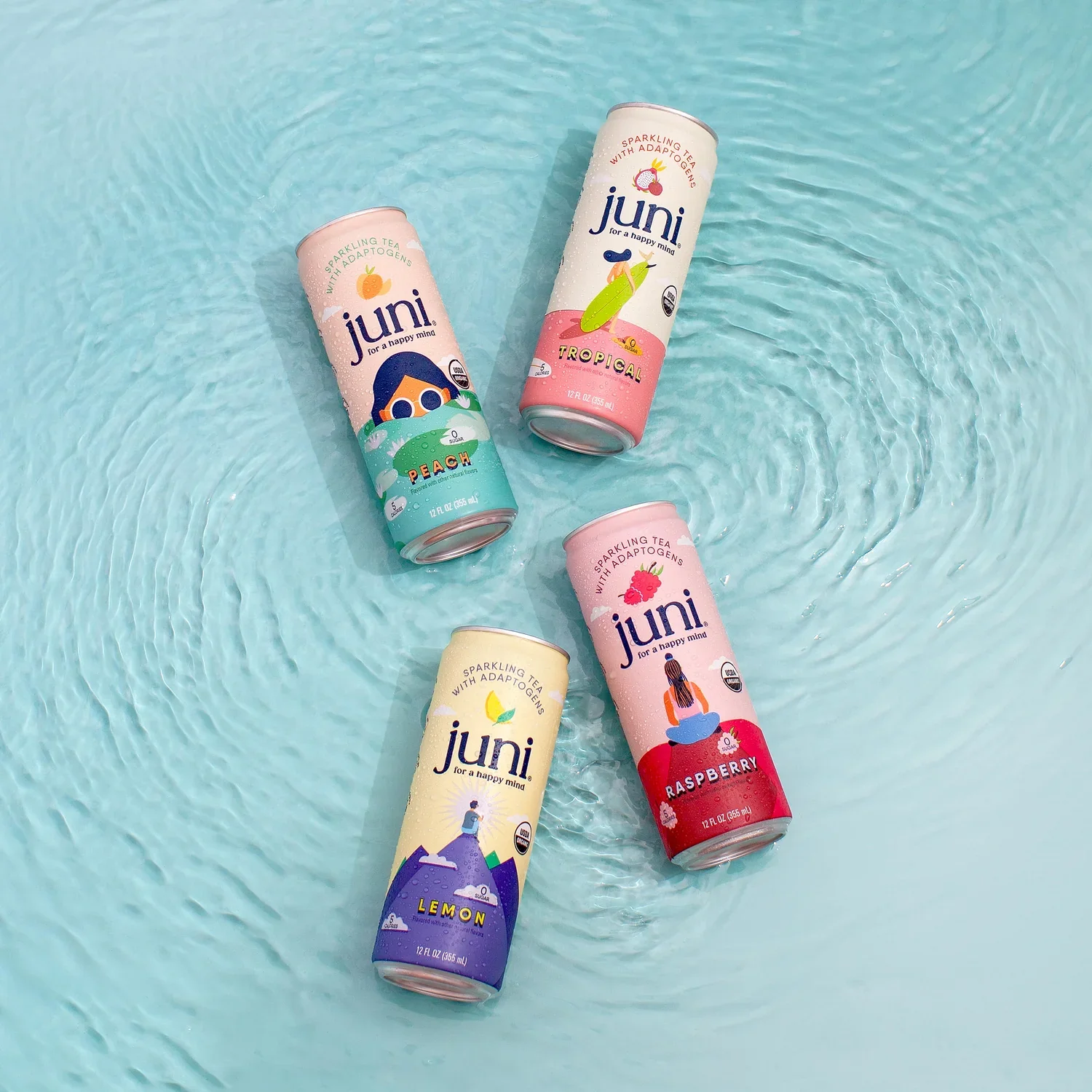
Image Courtesy: Drink Juni
Introduction: When Wellness Stopped Helping People Feel Better
Wellness, once positioned as relief, quietly became another form of exertion.
Morning routines grew longer. Supplement stacks expanded. Optimization replaced intuition. Even practices meant to soothe—meditation, breathwork, journaling—began to feel performative, tracked, and outcome-driven.
Juni entered this environment without urgency, explanation, or intensity.
It did not promise transformation.
It did not emphasize productivity, energy, or biohacking.
It did not frame calm as an achievement.
This Juni case study explores how the brand succeeded not by adding value in the traditional sense, but by subtracting stimulation—positioning itself as a companion to emotional regulation rather than a tool for self-improvement.
The Cultural Tension: A World That Forgot How to Slow
Modern wellness culture reflects a deep contradiction. It claims to support balance while rewarding constant improvement. Calm is encouraged, but only if it leads to better output.
Anthropologically, this creates fatigue at the nervous-system level.
Juni’s brand strategy responds to this tension not with rebellion, but with refusal. It opts out of urgency. It declines the demand to quantify feeling states. Instead of asking consumers what they want to achieve, it asks—implicitly—how they want to feel.
This reframing is subtle, but powerful. Juni positions calm not as a break from normal life, but as a viable way to inhabit it.
Founder Presence as Nervous-System Cue

Image Courtsey: Drink Juni
Juni’s founders, Radhi Devlukia and Jay Shetty, are often discussed in terms of visibility. But for Juni, presence matters more than reach.
Radhi Devlukia’s public demeanor is not aspirational in the conventional sense. It is grounded, slow, and non-performative. She does not speak at an audience; she settles into one.
Psychologically, this functions as co-regulation. Humans instinctively attune to calm states in others. Juni’s brand leadership models regulation rather than instruction, allowing the brand to feel safe rather than persuasive.
This is not influence through authority.
It is reassurance through presence.
The Product as a Pause, Not a Promise
Juni’s adaptogenic beverages are not positioned as solutions. They are positioned as moments.
There is no language of “fixing,” “boosting,” or “optimizing.” The drinks are framed as gentle support—something you turn to, not something that acts upon you.
From a behavioral perspective, this distinction matters. Products that promise results introduce pressure. Products that support states invite softness.
Juni’s beverage branding understands that calm cannot be pursued aggressively. It must be allowed. The product becomes an environmental cue—a signal to slow—rather than a functional demand.
Design as Regulation, Not Aesthetic
Juni’s visual language is deliberately restrained.
Neutral tones, soft textures, generous negative space, and unhurried layouts create what psychologists describe as low-arousal environments. There is no visual urgency. No call to action. No emphasis on novelty.
Anthropologically, this matters because design regulates before cognition. Juni’s branding communicates safety before comprehension.
Unlike wellness brands that aestheticize spirituality or dramatize mindfulness, Juni keeps design gentle and unassuming. It does not ask to be admired. It asks to be felt.
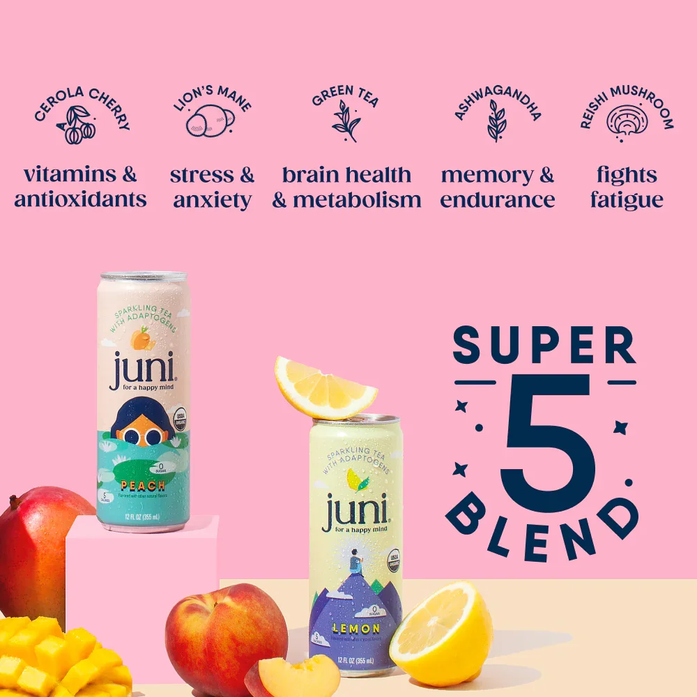
Image Courtesy: Drink Juni
Language as Emotional Instruction
Juni’s copy is slow by design.
Sentences are short. Claims are modest. There is an absence of hype-based verbs. This linguistic restraint mirrors its psychological intent: to lower internal noise, not add to it.
In nervous system branding, language functions as a pacing mechanism. Juni’s language gives permission to pause mid-thought. It does not rush the reader toward insight or action.
This is a quiet but disciplined choice—and one that reinforces the brand’s credibility. Calm here is not ornamental. It is structural.
Why Juni Chose Soft Power Over Scale Energy
Juni does not compete for dominance. It does not attempt to become ubiquitous, urgent, or loud. This is not a limitation—it is strategic clarity.
By refusing overstimulation, Juni protects its emotional contract with the consumer. The brand understands that calm cannot be mass-performed without losing integrity.
Where many wellness brands chase visibility, Juni protects tone. Where others build momentum, Juni builds trust.
This strategic restraint positions Juni less as a product brand and more as an emotional orientation.
Strategic Takeaways for Brand Builders
Juni’s marketing strategy offers a rare set of lessons:
Calm can be a credible position, not a passive one
Emotional regulation is emerging as a core consumer need
Founder presence can model behavior rather than instruct it
Design and language can function as nervous-system cues
Subtraction can be more differentiating than addition
Juni wins by refusing to compete on volume, intensity, or promise.
Conclusion: Calm as a Source of Authority
Juni reveals an important shift in modern branding.
As consumers grow overstimulated and distrustful of optimization narratives, authority is quietly moving toward brands that make people feel settled rather than activated.
Juni does not tell people how to live better lives.
It creates space for people to feel better inside the lives they already have.
In the next era of wellness, power will not belong to the most stimulating brands—but to the ones that know when to be still.
Top 5 Essential Reads to Deepen This Juni Case Study
1. Primal Branding — Patrick Hanlon
Why: Juni is a textbook example of belief-based branding without aggression. Its rituals (slow sipping, intentional pauses), icons (muted palettes, minimal cues), and creed (calm over control) demonstrate how brands can create stickiness through shared meaning rather than dominance.
2. How Brands Grow — Byron Sharp
Why: At first glance, Juni appears too niche, too intentional, too soft to fit Sharp’s model. That’s exactly why the book is relevant. Juni’s calm aesthetic, consistent tone, and repetitive emotional signal build mental availability—not through volume, but through recognizability. This helps explain how a brand that avoids urgency can still occupy space in memory and routine. This is not about mass persuasion. It’s about quiet salience.
3. Start With Why — Simon Sinek
Why: Juni’s “why” is not a mission statement—it’s an emotional orientation. Radhi and Jay’s emphasis on intentional living, presence, and self-connection is embedded across product, language, pacing, and design. Sinek’s framework helps articulate how Juni maintains internal coherence. Consumers feel alignment not because they are told the “why,” but because every touchpoint behaves as if it already believes it.
Why it matters for a brand that doesn’t chase virality: Juni doesn’t spread by being exciting. It spreads by being emotionally resonant. Berger’s work on social currency and emotion explains why calm, when rare, becomes shareable. Juni gives people something different to signal—not energy or success, but regulation and thoughtfulness. The book helps decode how Juni turns non-performance into a form of cultural signaling.
5. Brand Seduction — Daryl Weber
Why this is especially important for Juni: Weber’s exploration of subconscious branding and neuroscience is crucial for understanding Juni’s design and tone. Juni persuades below the level of words—through softness, pacing, and visual safety. This book explains how certain cues bypass rational evaluation entirely and act directly on emotion and instinct. Juni’s success isn’t driven by claims—it’s driven by felt response.
Poppi vs Olipop: Two Ways of Making Health Feel Acceptable
A psychological contrast in pleasure, permission, and legitimacy
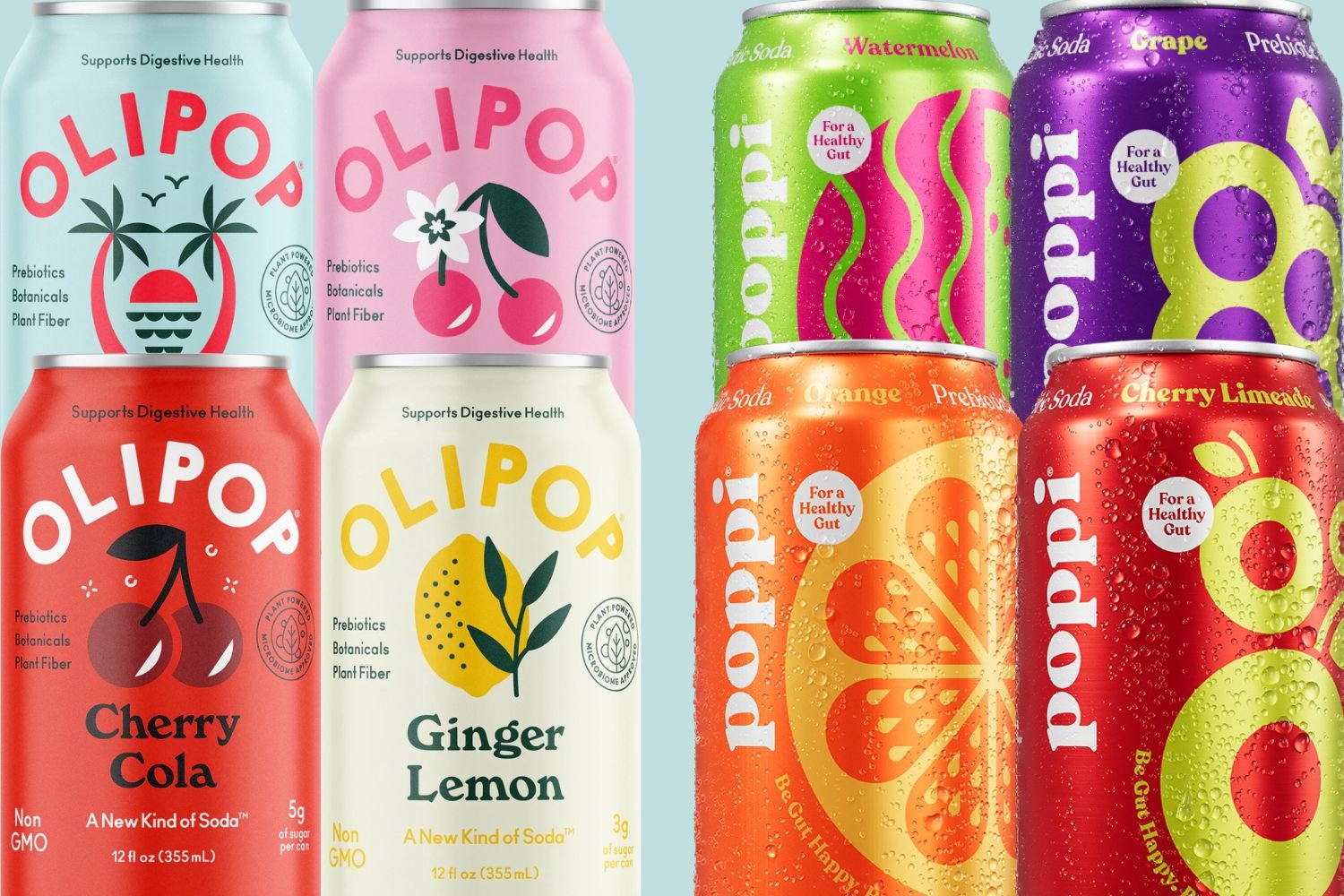
Image Courtesy: PHS News
Introduction: Health Was Never the Problem — Permission Was
For years, consumers knew soda was “bad.”
The problem wasn’t information.
It was desire.
People didn’t stop drinking soda because they lacked discipline or education. They stopped because the wellness culture made pleasure feel irresponsible — even morally suspect.
Poppi and Olipop didn’t reinvent soda.
They reinvented permission.
Both entered the market to resolve the same tension:
How do you make health compatible with enjoyment?
Their answers, however, reveal two very different belief systems about the consumer.
The Same Product, Two Emotional Contracts
At the functional level, Poppi and Olipop are nearly identical:
prebiotic sodas
lower sugar
positioned as “better for you”
But psychologically, they are opposites.
Poppi resolves tension through pleasure
Olipop resolves tension through legitimacy
This isn’t branding nuance.
It’s ideology.
Image Courtesy: Drinkpoppi
Poppi: Health Without Apology
Poppi begins with a simple assumption:
People don’t want to be corrected. They want to be relieved of guilt.
Its branding is bright, playful, and unserious — intentionally so. The cans don’t instruct. They invite.
Poppi doesn’t ask the consumer to understand gut health or prebiotics. It doesn’t frame consumption as a choice requiring justification.
It says:
You’re allowed to enjoy this.
This taps into a deep emotional truth:
Pleasure feels safer when it doesn’t require explanation.
Poppi functions as emotional permission.
Olipop: Health That Has Earned the Right to Be Enjoyed
Olipop assumes something very different about the consumer.
It assumes skepticism.
Its language leans functional. Its branding is retro but composed. Its ingredient story is front-and-center. Even the flavor names feel deliberate rather than carefree.
Olipop doesn’t remove guilt.
It overrides it.
Enjoyment is allowed — but only because it has been earned through logic, formulation, and credibility.
This appeals to a consumer who doesn’t want to feel indulgent — they want to feel correct.
Olipop functions as cognitive reassurance.

Image Courtesy: DrinkOlipop
Pleasure vs Legitimacy
Here is the core divide:
Poppi makes health pleasurable first, then quietly acceptable.
Olipop makes health acceptable first, then cautiously pleasurable.
Poppi dissolves resistance by lowering seriousness.
Olipop dissolves resistance by raising confidence.
One bypasses scrutiny.
The other satisfies it.
Design as Emotional Instruction
Design teaches the consumer how to feel before the product is tasted.
Poppi’s design is colorful, loud, and joyful. It signals play. It lowers the stakes. It makes health feel casual.
Olipop’s design is structured and nostalgic. It evokes familiarity and trust. It signals that this product has been thought through.
Neither is aesthetic indulgence.
Both are psychological cues.
Poppi says: Relax.
Olipop says: Trust us.
What Each Brand Asks of the Consumer
This is where the contrast becomes personal.
Poppi asks you to:
stop overthinking
stop justifying
let enjoyment be enough
Olipop asks you to:
believe in formulation
respect process
feel reassured by evidence
Neither asks you to give something up —
but they demand different kinds of comfort.
The Unspoken Tradeoffs
Here’s the tension neither brand resolves fully:
Pleasure without legitimacy risks dismissal.
Legitimacy without warmth risks rigidity.
Poppi may be underestimated by those who equate seriousness with credibility.
Olipop may feel emotionally distant to those tired of earning indulgence.
And yet — both brands succeed.
Because they answer different psychological needs, not different functional ones.
Why Both Brands Worked
Poppi and Olipop succeeded because they were internally coherent.
They didn’t hedge between joy and seriousness.
They didn’t try to speak to everyone at once.
They respected the emotional state they were addressing.
In a wellness culture obsessed with optimization, both brands did something counterintuitive:
They focused on how health should feel, not just what it should do.
Conclusion: Health Is Emotional Long Before It Is Rational
Poppi and Olipop remind us that wellness is rarely rejected because it doesn’t work.
It’s rejected because it asks too much — emotionally.
Some consumers need permission.
Others need proof.
Neither is wrong.
But confusing the two collapses trust.
These brands don’t compete because of flavor or formulation.
They compete because they encode two different philosophies of self-care:
one that softens judgment
one that satisfies it
And in modern wellness culture, understanding that difference is everything.
Olipop: How Nostalgia Became Trust in Modern Wellness Branding
A cultural case study in reassurance, memory, and emotional credibility
Image Courtesy: Sporked
Introduction: When Wellness Needed Stability, Not More Innovation
By the time Olipop entered the wellness beverage space, health culture was not lacking solutions. It was lacking confidence.
Consumers had grown accustomed to novelty—new ingredients, new claims, new identities—but that abundance created friction. Functional beverages multiplied, yet trust eroded. Health felt increasingly experimental, provisional, and psychologically demanding.
Olipop did not attempt to invigorate wellness with novelty.
It steadied it with familiarity.
This Olipop case study explores how the brand succeeded not by reinventing soda, but by restoring emotional credibility to a category that had lost it. Where many wellness brands chased transformation, Olipop offered something quieter—and ultimately more stabilizing: reassurance.
Repairing a Category, Not Disrupting It
Soda once represented ubiquity. Shared meals. Reliable pleasure. Over time, it became symbolically burdened—linked to excess and irresponsibility—while health beverages moved in the opposite direction, growing complex and morally charged.
Olipop’s brand strategy addressed a deeper cultural problem: soda no longer felt trustworthy, and wellness no longer felt grounded.
Instead of rejecting soda culture outright, Olipop reframed its role. Soda didn’t need to be replaced; it needed to be repaired. The brand presented itself as a functional soda that preserved what soda once offered emotionally—familiarity, continuity, presence—while quietly updating its physiological profile.
Anthropologically, this matters because cultures gravitate toward what feels stable in times of overload. Olipop succeeded by positioning itself not as progress, but as restoration.
Origin as Emotional Legitimacy
Olipop’s founding story centers on digestive health, but its deeper resonance lies in its philosophical restraint. Founders Ben Goodwin and David Khang focused not only on formulation, but on experience continuity—the texture, taste, and rituals consumers already understood.
Rather than dramatizing disruption, Olipop pursued legitimacy through recognizability.
This is a subtle but powerful distinction in branding psychology. Trust is rarely built through intensity. It is built when innovation does not demand emotional reorientation.
Olipop honored the past without romanticizing it. In doing so, it gave consumers permission to reengage with soda without having to renegotiate their values.
Nostalgia as Psychological Infrastructure

Image Courtesy: Mundane Magazine
Olipop’s soda branding is often described as retro. Psychologically, it functions as something more foundational.
Nostalgia operates as a stability cue. It lowers uncertainty, softens skepticism, and signals emotional safety. In contexts where consumers feel fatigued by constant newness, nostalgic cues act as reassurance—this will not ask too much of you.
Olipop’s classic flavor names, vintage typography, and heritage-inspired layouts reactivated emotional memory without encouraging excess. This allowed the brand to introduce functional claims—fiber, prebiotics—without activating resistance.
The past, here, became scaffolding for trust.
Design as Evidence, Not Expression
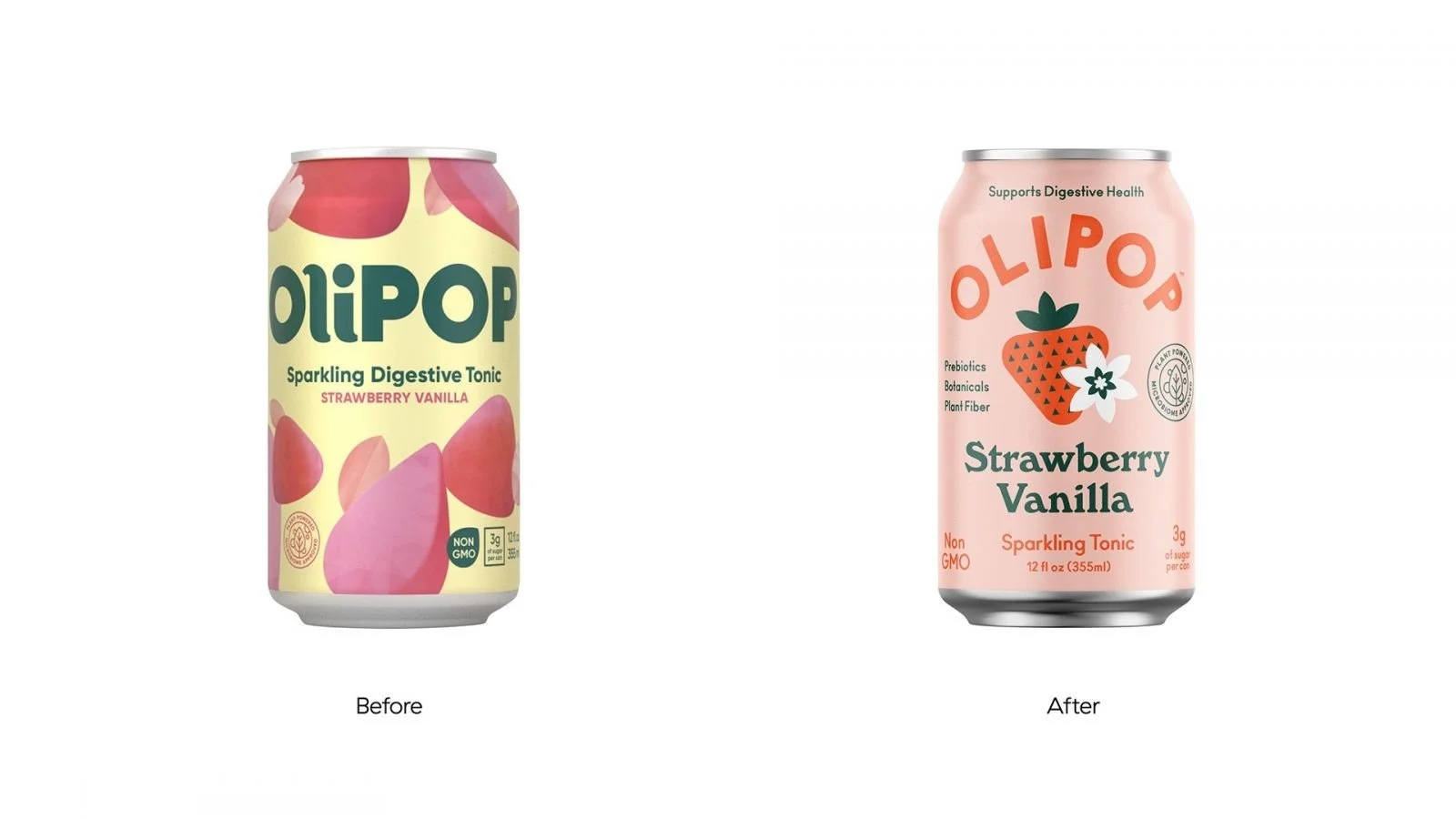
The re-brand that drove $500M success
Olipop’s can design reflects a deeper cultural and psychological shift in how the brand positions itself. Earlier expressions leaned more heavily on function—signaling digestive benefit and wellness utility in ways that required explanation. Over time, the visual language moved away from the logic of a “sparkling digestive tonic” and toward something quieter and more assured.
This evolution matters. As Olipop gained cultural traction, it no longer needed to justify its function at the point of purchase. Instead, the can began doing subtler work: placing the brand firmly within the mental category of everyday soda, without relinquishing its functional credibility. The design does not announce health. It assumes trust.
Anthropologically, packaging is often the first site of belief. Before ingredients are read or benefits evaluated, consumers make a rapid, subconscious judgment about whether something belongs. Olipop’s can no longer asks to be interpreted or decoded. It asks to be accepted.
Its restraint—balanced hierarchy, familiar proportions, deliberate composure—signals stability rather than novelty. In a market crowded with visual urgency, Olipop chose calm. This was not an aesthetic decision so much as a psychological one. The can does not perform wellness. It normalizes it.
In moving from explanation to composure, Olipop used design not as expression, but as evidence: evidence that the brand understands where it sits, what role it plays, and how little it now needs to prove.
Functional Benefits Without Emotional Escalation
In prebiotic soda marketing, balance is rare. Many brands overwhelm consumers with science or bury benefit under lifestyle imagery.
Olipop maintains credibility through moderation.
Its health claims are present but secondary, clear but uninsistent. This lowers cognitive friction while maintaining trust—an essential balance when reassurance is the primary emotional job.
Importantly, Olipop does not frame health as self-improvement. It frames it as maintenance. A way to continue enjoying what already exists, without consequence.
A Note on Positioning: Two Functional Sodas, Two Emotional Jobs
Image Courtesy: Eat This Not That
Both Olipop and Poppi occupy the same product category—functional, low-sugar soda. Yet their cultural success illustrates a crucial branding truth: consumers are not choosing between formulations. They are choosing between emotional resolutions.
Olipop operates through familiarity and reassurance. Its branding draws on memory, continuity, and trust—making soda feel dependable again.
Poppi, by contrast, works through lightness and release. Its visual language and tone reduce emotional pressure, reframing wellness as playful rather than corrective.
Neither approach is superior. Each responds to a different psychological fatigue within contemporary wellness culture.
What matters is not the category itself, but the emotional work the brand performs.
Strategic Takeaways for Brand Builders
Olipop’s marketing strategy offers several enduring insights:
Reassurance can outperform reinvention in saturated categories
Nostalgia, when used deliberately, functions as psychological safety
Continuity lowers resistance to adoption
Design can signal trust as powerfully as it signals differentiation
Emotional memory is a competitive asset in wellness branding
Olipop didn’t compete on excitement.
It competed on stability.
Conclusion: Olipop and the Return of Emotional Reliability
Olipop reveals a quiet truth about modern branding.
When categories become crowded and belief becomes fragile, the brands that thrive are not those that shout louder—but those that steady the field.
Olipop modernized soda not by distancing itself from the past, but by reconciling with it.
In doing so, it demonstrated that trust is built not through acceleration, but through emotional grounding.
Top 5 Essential Reads to Deepen This Olipop Case Study
1. The Nostalgia Factory — Douwe Draaisma
Why it matters: Explores how memory influences emotional decision-making and why familiarity reduces uncertainty.
2. Alchemy — Rory Sutherland
Why it matters: Explains why perceived reassurance often outperforms objective improvement.
3. How Brands Grow – Part 2 — Byron Sharp
Why it matters: Olipop’s distinctive yet familiar assets build mental availability without relying on novelty.
4. Primal Branding — Patrick Hanlon
Why it matters: Olipop’s icons, rituals, and creation story reinforce belief through continuity.
5. The Experience Economy — Pine & Gilmore
Why it matters: Olipop preserves a familiar consumption experience while quietly upgrading its value.
Poppi: The Functional Soda That Made Wellness Feel Light Again
Image Courtesy: Poppi
A cultural case study in emotional branding and consumer psychology
Introduction: When Wellness Became Heavy
At some point, wellness stopped feeling like care and started feeling like work.
Rules multiplied. Ingredient scrutiny intensified. Even pleasure came with a moral tax.
Poppi emerged not as a solution to a nutritional problem, but as a response to an emotional one.
This Poppi case study explores how a functional soda brand won cultural relevance by reducing the weight attached to health choices—weight that had quietly accumulated through years of optimization-driven wellness marketing. Rather than asking consumers to do better, Poppi made it easier to feel okay.
The result was not just adoption, but affection.
Category Reframe: From Moralized Soda to Everyday Balance
In the cultural imagination, soda had become symbolic—linked to excess, irresponsibility, and regret. Health beverages, meanwhile, were coded as serious, corrective, and quietly judgmental.
Poppi’s brand strategy didn’t argue with either side. It dissolved the tension.
By positioning itself as a functional soda—lightly carbonated, low-sugar, prebiotic-supported—Poppi reframed the category from “good vs. bad” into livable vs. untenable. The brand didn’t seek superiority in formulation so much as compatibility with daily life.
Anthropologically, this matters because cultures adopt what feels sustainable. Brands that survive do not demand moral perfection; they minimize moral load. In that sense, Poppi’s marketing strategy succeeded by asking for less—less discipline, less justification, less self-surveillance.
Poppi didn’t cleanse soda of guilt. It made guilt irrelevant.
Origin as Cultural Alignment (Not Innovation Theater)
The Poppi origin story—often cited from its Shark Tank chapter—matters not because it’s dramatic, but because it is recognizable. Founder Allison Ellsworth’s digestive issues and early experimentation with apple cider vinegar mirror a widely shared wellness impulse: self-experimentation born from frustration with extremes.

Founder Allison Ellsworth. Image Courtesy: Fortune
The early brand (“Mother Beverage”) foregrounded function and heritage. The rebrand to “Poppi” marked a cultural shift—from explanation to expression. This wasn’t cosmetic. It signaled an understanding that, by the time Poppi scaled, consumers no longer needed proof that gut health mattered. They needed permission to stop trying so hard.
Here, origin served as alignment, not spectacle. The story validated Poppi as a response to the moment it entered—not as a category disruptor, but as a cultural companion.
The Psychology of Lightness: Why Adoption Felt Effortless
Poppi’s rise in prebiotic soda marketing can be understood through a small set of powerful psychological mechanisms—quietly orchestrated.
Emotional Lightness (Cognitive Load Reduction)
Poppi minimized decision fatigue. Simple claims, approachable flavors, and cheerful design reduced the mental work required to choose “well.”
Habit Substitution
Rather than asking consumers to abandon soda rituals, Poppi preserved them. Behavioral science consistently shows replacement outperforms elimination when habits are emotionally encoded.
Health Halo Without Intimidation
“Prebiotics” communicated benefit without demanding expertise. This kept credibility high while friction stayed low—an ideal balance in wellness beverage branding.
Identity Soft-Signaling
Poppi functioned as a socially fluent object. Being seen with it suggested alignment with modern wellness without broadcasting intensity or dogma.
Together, these elements explain why Poppi spread through kitchens, offices, fridges, and social feeds—not through persuasion, but normalization.
Design as Cultural Language (Not Decoration)
Image Courtesy: DIELINE
Poppi’s soda branding did much of the work before language ever appeared.
Bright, saturated colors; flat graphic forms; friendly typography—these choices communicated mood first, meaning second. In contrast to austere health aesthetics, Poppi’s look signaled approachability. It felt low-stakes.
Anthropologically, color operates as a pre-verbal signal. Here, it told consumers what Poppi wouldn’t be: strict, punishing, self-serious. The popularity of Poppi in “fridge restock” content wasn’t accidental. The product performed visually—turning storage into display and consumption into a social cue.
Design didn’t amplify function. It translated values.
Virality Through Belonging, Not Hype
Poppi’s inclusion among viral wellness brands wasn’t driven by spectacle. It was driven by visibility within ordinary life. Influencer presence felt embedded rather than imposed, aligning with social identity theory: people adopt what they see reflected in groups they recognize.
Poppi didn’t ask to be shared. It made sharing feel natural.
That distinction matters. Brands that over-perform theatrically often peak fast. Brands that blend into identity systems compound.
Strategic Takeaways for Brand Builders
This Poppi marketing strategy offers several enduring lessons:
Cultural relief outperforms functional supremacy in moralized categories
Subtraction (less pressure) can create more value than addition
Habit preservation beats behavior correction
Visual language should express emotional posture, not just differentiation
Adoption accelerates when brands lower psychological cost
Poppi’s success wasn’t built on telling people what to do. It was built on making their choices feel lighter.
Conclusion: What Poppi Reveals About the Next Era of Wellness
Poppi is not a rejection of health culture. It is a recalibration of it.
As wellness matures, brands that thrive will trade commandments for companionship. They will offer balance instead of benchmarks. They will recognize that consistency is emotional before it is rational.
In that future, the most powerful brands won’t promise transformation.
They will promise continuity—without the weight.
That is Poppi’s quiet achievement.
Top 5 Essential Reads to Deepen This Poppi Case Study
1. Alchemy — Rory Sutherland
Why it matters: Poppi’s success is a lesson in reframing perception rather than optimizing product—a core tenet of behavioral economics.
2. The Experience Economy — Pine & Gilmore
Why it matters: Poppi transforms a beverage into a mood. This lens explains why experiential value now drives differentiation in commoditized categories.
3. Consumed — Benjamin R. Barber
Why it matters: Barber’s critique of pleasure wrapped in responsibility offers a powerful frame for understanding Poppi’s cultural appeal.
4. The Paradox of Choice — Barry Schwartz
Why it matters: Poppi reduces decision fatigue—an underappreciated driver of adoption in crowded wellness spaces.
5. Primal Branding — Patrick Hanlon
Why it matters: Poppi’s creation story, visual icons, and everyday rituals quietly build belief and belonging over time.
AG1: Redefining Wellness, One Daily Scoop at a Time
It all begins with an idea.
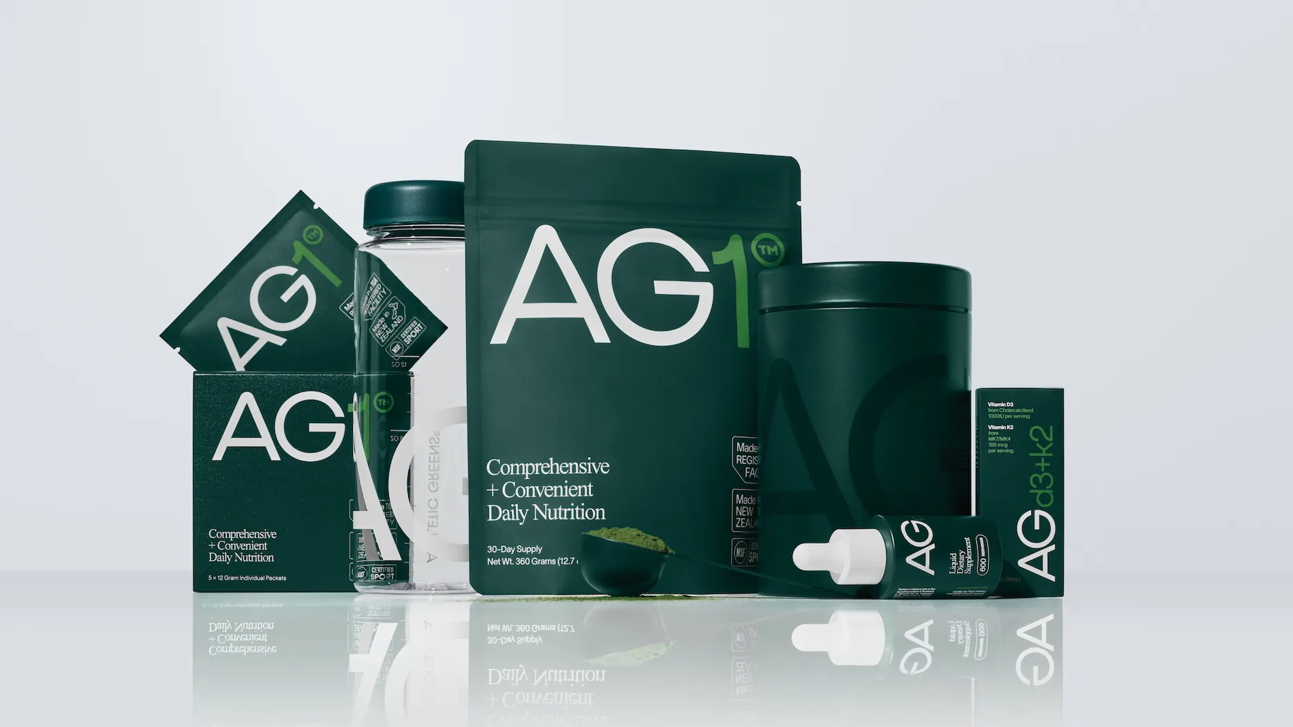
Image Courtsey: AG1
Imagine a world where you could combine the benefits of 75 vitamins, minerals, and whole-food-sourced nutrients into a single, delicious scoop. For years, the wellness industry overwhelmed consumers with shelves filled with supplements—each promising the key to health but leaving many confused, fatigued, and still searching for a solution. AG1 (formerly Athletic Greens) stepped in to change all of that.
Launched by Chris Ashenden, AG1 didn’t just create a product; it redefined the supplement game. With its focus on simplicity, premium quality, and science-backed nutrition, AG1 has become more than a green powder—it’s a lifestyle. Let’s uncover the strategies and psychology behind AG1’s journey, and see how this brand is reshaping the wellness conversation.

Image Courtsey: NZ Health
1. Redefining Wellness: Positioning AG1 as a Daily Essential
AG1 didn’t just launch a greens powder — it redefined the wellness category. While traditional supplements targeted fitness enthusiasts or the aging population, AG1 widened the lens. It became the go-to solution for health-conscious individuals seeking simplicity, reliability, and daily wellness integration. From busy professionals to mindful parents, AG1 positioned itself as an essential habit—not an optional add-on.
This approach taps into brand evangelism psychology—a strategy where customers don’t just use the product, they believe in it. AG1 framed itself as a vital part of your morning routine—akin to brushing your teeth or drinking coffee. This habit-based integration helps foster emotional attachment and automaticity, turning customers into daily users and vocal advocates. They don’t just consume AG1; they live it and share it.
A bold, strategic move that solidified this shift was the brand’s evolution from Athletic Greens to AG1.

The move from “Athletic Greens” to “AG1” wasn’t just a name change — it was a bold repositioning strategy. It signaled a shift from niche sports performance to a premium, all-in-one wellness ritual.
In the psychology of branding, shorter, alphanumeric names often convey simplicity, modernity, and authority. AG1 positioned itself not just as a supplement, but as the foundational product in your health stack — clean, minimal, and science-backed. The rebrand reflected their confidence: they no longer needed to explain what they were. The product had become iconic on its own.
he new name embraced modernity, simplicity, and confidence. “AG1” evokes a sense of performance, science, and minimalism—backed by real benefits. This alphanumeric rebranding also removed the limiting “athletic” connotation, inviting a wider demographic into the fold and aligning the brand with the emerging identity of whole-self optimization.
Combined with sleek, minimalist packaging and an elevated user experience, AG1 became more than a product—it became a lifestyle. A symbol. A statement.
Brand Comparison: This approach is similar to what brands like Ritual and Seed have done in the supplement space—focusing on a streamlined, high-quality product that simplifies wellness routines and encourages routine use. However, AG1 takes it a step further by integrating the concept of holistic health and positioning itself as a complete lifestyle choice rather than a single supplement.
2. Trust Through Transparency: Quality and Integrity as Brand Pillars

Image Courtsey: AG1
AG1 has built trust by prioritizing ingredient transparency, which resonates strongly with health-conscious consumers. In a market where many products lack clarity on sourcing and efficacy, Athletic Greens differentiates itself by disclosing each ingredient’s quality and purpose. This transparency aligns with values-based branding, where the brand’s commitment to quality resonates with an audience that values honesty and integrity.
This strategy also leans on credibility psychology. By clearly communicating the rigorous testing and research behind each ingredient, AG1 reassures customers of the product’s quality and safety, which is especially important in the supplement market, where skepticism is common. Athletic Greens highlights how AG1 ingredients are sourced from high-quality suppliers and tested for bioavailability, underscoring the brand’s commitment to health.
The Psychological Impact: This commitment to transparency and quality builds consumer trust, a crucial component in establishing loyalty. By openly sharing AG1’s sourcing and testing standards, Athletic Greens creates a level of credibility that reassures customers about the efficacy and safety of the product. This approach builds long-term loyalty, positioning AG1 as a trustworthy and dependable choice within the wellness space.
3. Leveraging Authority: Influencer Partnerships that Build Trust and Community
AG1’s partnership strategy is highly selective, focusing on influencers and thought leaders who align with the brand’s values. Instead of general endorsements, Athletic Greens collaborates with figures like Tim Ferriss, Dr. Andrew Huberman, and other respected individuals in the health and wellness space. These influencers are seen as authorities, and their endorsements lend an expert-backed credibility to AG1.
This partnership strategy taps into social proof and expert authority, both of which increase the product’s perceived value. By associating AG1 with influencers who are health advocates, the brand effectively extends its message of quality and holistic health to a larger, yet carefully curated, audience. This choice of partners attracts customers who seek not just health benefits but expert approval.
Comparative Analysis: Unlike brands that use celebrity endorsements purely for visibility, Athletic Greens chooses influencers with credibility in the health space, making the endorsements feel authentic. This focus on expert influencers creates an educational angle to AG1’s branding, positioning it as a scientifically sound choice rather than a trendy product.
Deeper Insight: This selective approach to influencer partnerships also taps into psychological alignment, where consumers trust endorsements from figures they believe genuinely care about their well-being. By choosing influencers who are vocal about their own wellness routines, AG1 builds a brand narrative around authenticity and trust, which strengthens its community-driven appeal.
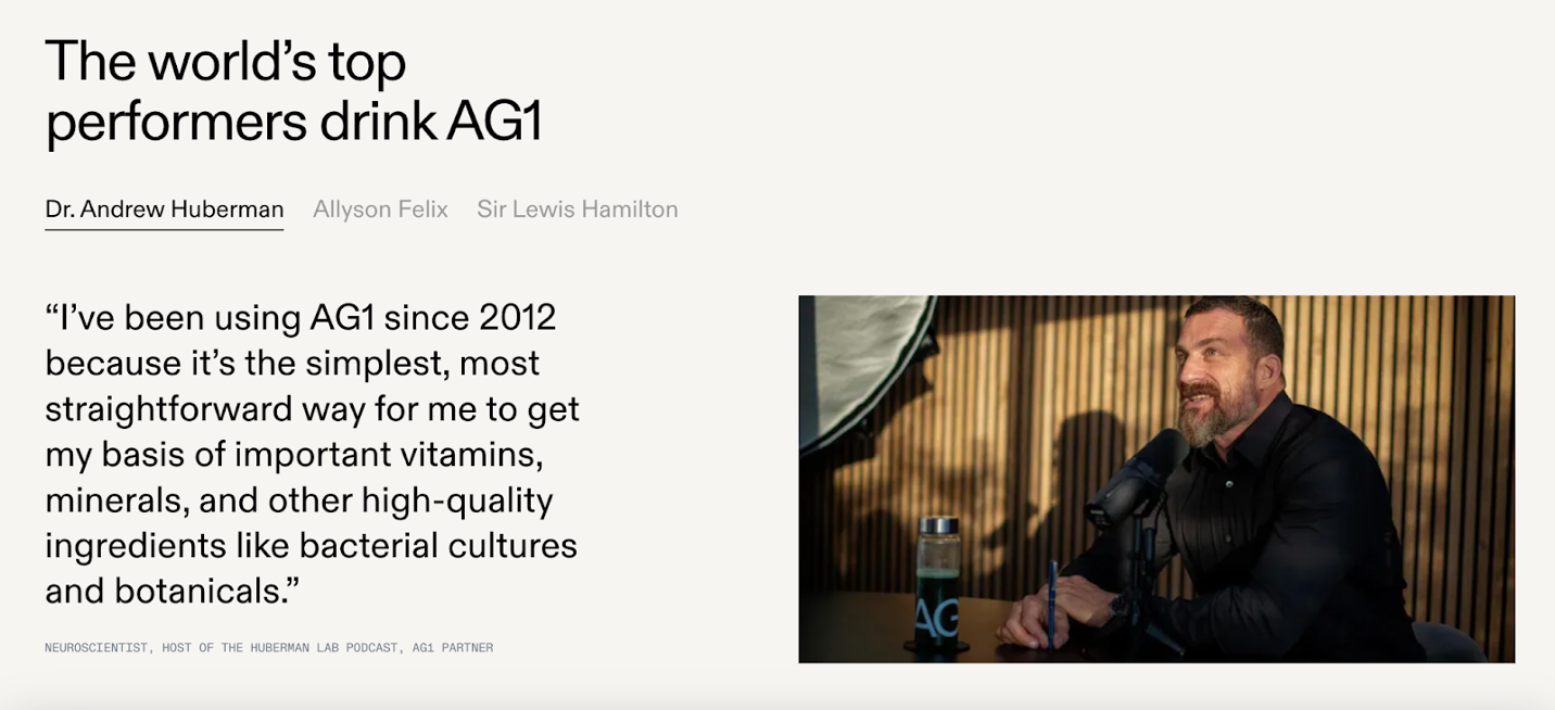
4. Fostering a Community of Wellness Advocates
Athletic Greens doesn’t just acquire customers—it cultivates a community of wellness advocates. The brand creates a sense of belonging by encouraging customers to see themselves as part of a shared wellness journey. This is achieved through various community initiatives, including regular wellness tips, exclusive educational content, and feedback loops that involve customers in the product’s evolution.
This focus on community aligns with relationship marketing, where the goal is to build long-term connections rather than one-time transactions. Through member-exclusive content, Athletic Greens not only keeps customers engaged but makes them feel valued and invested in the brand’s mission. This approach turns AG1 into a brand that customers actively champion, sharing their experiences and inviting others into the AG1 community.
Social Identity Theory: This strategy also leverages social identity theory, which suggests that people define themselves through the groups they belong to. AG1’s community fosters a shared identity among health-conscious individuals, creating a sense of pride and belonging that goes beyond the product. This psychological strategy enhances customer retention and encourages customers to become brand ambassadors, organically promoting AG1 to their networks.
Brand Loyalty: By positioning AG1 as more than a product—as a community-focused brand that cares about its users—Athletic Greens cultivates a base of loyal advocates. This loyalty is built on shared values and identity, transforming AG1 users into supporters who actively contribute to the brand’s growth.
5. Minimalist Design and the Power of Wellness Aesthetics
AG1’s minimalist design—clean packaging, muted colors, and modern typography—conveys simplicity and quality. Athletic Greens has positioned AG1’s branding to appeal to wellness-conscious consumers who appreciate products that not only support their health goals but also fit seamlessly into their routines and environments. The design is reflective of lifestyle branding, where the product represents an ideal rather than just a function.
The minimalist aesthetic reinforces AG1’s core brand message of “simplifying health.” This approach appeals to consumers who value products that offer quality without unnecessary complexity, positioning AG1 as a sophisticated yet accessible choice in the wellness market. By visually aligning with the aspirational wellness lifestyle, Athletic Greens ensures that AG1’s look and feel resonate with its target audience.
Psychological Impact: This minimalist design appeals to aesthetic appeal psychology, where consumers are drawn to clean, visually pleasing products that align with their lifestyle choices. This design approach also conveys purity, a concept that aligns well with the health industry and reinforces AG1’s transparency and quality messaging. AG1’s design thus makes the product feel approachable, modern, and aligned with the aesthetic values of today’s wellness consumer.
Conclusion: The AG1 Blueprint for Building a Community-Centric Wellness Brand
AG1 by Athletic Greens offers a powerful case study in building a wellness brand that goes beyond functional benefits. By positioning AG1 as an essential daily ritual, emphasizing transparency and quality, strategically leveraging credible influencer partnerships, and cultivating a strong community, Athletic Greens has successfully created a brand that resonates with consumers on multiple levels.
This strategic blend of psychological insights, community-building efforts, and values-driven branding demonstrates how wellness brands can achieve longevity and loyalty by putting authenticity and trust at the center of their strategy. AG1 has transformed a daily greens powder into a movement that embodies the principles of health, transparency, and community—a blueprint for any brand aiming to build trust, loyalty, and impact in today’s wellness-focused world.
Top 5 Essential Reads to Master AG1’s Community-Driven Branding and Wellness Strategy
1. Building a StoryBrand: Clarify Your Message So Customers Will Listen by Donald Miller
Why: Miller’s framework helps brands craft clear, customer-centered messaging, positioning the brand as a guide on the consumer’s journey. AG1’s emphasis on “simplifying health” aligns with Miller’s approach, where AG1 isn’t just a product—it’s a tool that helps consumers take charge of their wellness with clarity and confidence. Miller’s principles of storytelling show how brands can build a relationship with customers by speaking directly to their needs, making AG1 feel like an essential and trusted part of the customer’s health journey.
2. Primal Branding: Create Belief Systems that Attract Communities by Patrick Hanlon
Why: This book introduces foundational brand elements—like rituals, icons, and a creation story—that turn customers into loyal brand advocates. AG1’s daily-use positioning taps into these primal branding elements, helping customers feel connected to a larger wellness tribe with shared values. Hanlon’s insights on creating brand rituals and fostering community engagement provide a framework for AG1’s “tribal” loyalty, showing how daily use of AG1 becomes a ritual that fosters a sense of belonging and commitment.
3. Influence: The Psychology of Persuasion by Robert Cialdini
Why: Cialdini’s principles of persuasion, especially authority and social proof, are vital for understanding AG1’s selective influencer partnerships with wellness experts and thought leaders. AG1’s collaboration with figures like Tim Ferriss leverages Cialdini’s concept of authority, building credibility and trust within a highly discerning market. This book reveals how endorsements from credible authorities can reinforce customer trust and drive loyalty, especially in industries where expertise and reliability are highly valued, like wellness and supplements
4. Brand Seduction: How Neuroscience Can Help Marketers Build Memorable Brands by Daryl Weber
Why: Daryl Weber’s book dives into the neuroscience of branding, exploring how brands can engage customers’ subconscious minds and create lasting impressions. Brand Seduction offers insights into the psychological aspects of brand loyalty and memory, which help explain AG1’s ability to position its product as a daily ritual.
5. Contagious: Why Things Catch On by Jonah Berger
Why: Berger’s research on why people talk about and share products highlights the principles behind AG1’s word-of-mouth growth. AG1’s community and influencer strategy align with Berger’s ideas on social currency and social proof, showing how brands can naturally inspire conversations and recommendations. Contagious provides actionable insights into making a brand inherently shareable, explaining how AG1’s social proof and community advocacy generate organic growth, making the brand feel like a trusted health movement.
I Stepped Away… and Then the Signs Brought Me Back

They say timing is everything.
Almost a year ago, I launched Beyond the Label with a spark—an idea rooted in my love for brands that aren’t just well-designed, but deeply thought through. Brands that make you feel something. That tell a story not through words alone, but through experience, trust, and intention.
But like many creative projects, life swept in with noise, responsibilities, and priorities. I parked the blog, thinking, “Maybe one day I’ll come back to it.”
And then came the email.
“You’ve received 10 clicks in the last 28 days.”
Ten may seem like a small number. But in a blog I hadn’t touched in ages, to me—it was a signal. A whisper that Beyond the Label still lived. That people were finding it. That maybe… it was time to return.
And the name still echoed with meaning.
Beyond the Label was never about surface-level branding. It was about digging deeper. Finding what really makes a brand unforgettable.
Why I’m Relaunching Beyond the Label
Because the world doesn’t need another listicle or product roundup.
It needs storytelling. Strategy. Soul.
I believe branding is part science, part psychology, and part poetry. And I want to explore brands that were built, not just launched. Brands that disrupted, shifted narratives, built tribes, and understood the emotional fabric of their consumers.
From wellness startups to design-forward product lines, I want to unpack:
How they made people care
What strategies shaped them
What we can learn and apply in our own journeys—whether you're a founder, marketer, or curious observer
What’s Next…
I’ll be posting deep dives into some of the most compelling brands in the world of nutrition, wellness, design, beauty, and more. Some you may already love. Others you’ll discover here first.
Each post will be:
Insightful, grounded in brand theory and strategy
Thought-provoking, exploring psychology, culture, and human behavior
And most of all, inspiring
Why It Matters (to Me—and Maybe You Too)
I’ve spent over a decade building and marketing brands in some of the most competitive industries. But Beyond the Label is where I explore the side of branding and consumer marketing that isn’t about boardrooms or KPIs—it’s about resonance.
This blog is for the ones who see branding as storytelling. As impact. As legacy.
If that’s you—welcome back with me. I’m picking up where I left off. And I think it’s going to be even better this time.
Let’s go deeper. Let’s look beyond the label.
Join the Conversation!
Got a brand you think deserves a deep dive? Something you’ve seen and thought, “They just get it”?
Send it my way. This blog isn’t just about what I love—it’s about what we’re all noticing.
Here’s to a relaunch with meaning.
Unpacking Our Place: Building a Brand Rooted in Culture, Inclusivity, and the Essence of Home
It all begins with an idea.

In a crowded marketplace of kitchenware brands, Our Place has carved out a unique identity by blending culture, inclusivity, and community. Founded by social entrepreneur Shiza Shahid, Our Place was designed to be more than a cookware brand; it’s a celebration of cultural rituals, family traditions, and the beauty of gathering around food. Let’s delve into how Our Place has used storytelling, experiential branding, values-based marketing, and consumer psychology to create an experience that resonates deeply with its customers, transforming cookware into a cultural movement.
1. Foundation of the Brand: Fostering Connection and Cultural Relevance
Unlike traditional cookware brands focused solely on functionality or luxury, Our Place positions itself as a cultural hub—a place where diverse backgrounds, traditions, and values find a reflection. Shiza Shahid’s vision from the start was clear: build a brand that not only offers high-quality cookware but also honors the cultural diversity of food and the role it plays in family life. By intentionally focusing on inclusivity and connection, Our Place transformed what could have been a utilitarian brand into an emotionally resonant experience.
Market Insight: Brand Anthropology in Action
This approach reflects the influence of brand anthropology, where brands aim to mirror real-life cultures, traditions, and identities. Our Place’s product designs, marketing language, and community initiatives are grounded in cultural storytelling, embodying cultural branding. The brand itself becomes a cultural icon by embedding societal values and narratives, serving as more than just a practical tool. Our Place taps into cultural pride, diversity, and the celebration of heritage, giving it emotional depth in a market often focused on functionality.
2. Storytelling as Strategy: Crafting a Narrative of Togetherness and Belonging
One of the most compelling aspects of Our Place’s branding is its storytelling approach, which moves beyond showcasing products to highlight values of togetherness, heritage, and inclusivity. The brand’s content taps into the universal idea that food has the power to connect people across generations and cultures. From showcasing dishes representing various culinary traditions to featuring diverse families preparing meals, the brand weaves a narrative that celebrates shared cultural experiences.
Market Insight: Nostalgia Marketing and Experiential Branding
Our Place’s storytelling approach draws on nostalgia marketing, connecting customers to familiar memories and cultural touchpoints. This strategy uses visuals—such as families folding dumplings, cooking tamales, or making curry—that evoke warmth, comfort, and nostalgia. Through this experiential branding, Our Place subtly reminds customers of cherished family moments, creating an emotional bridge between personal experience and brand mission.
Concept to Consider: Social Identity Theory
In a deeper psychological sense, Our Place’s storytelling taps into social identity theory, which suggests that people define part of their identity through the groups they belong to. By framing itself as a brand that values diversity and cultural heritage, Our Place allows customers to see their identities reflected, creating a powerful sense of belonging. This sense of identification transforms the brand into a community that customers feel proud to support and engage with.
3. Design Philosophy: Where Functionality Meets Emotional Design
On the surface, Our Place’s product line is minimalist, featuring essentials like the multifunctional Always Pan and the Perfect Pot. This simplicity is intentional. By focusing on essential items designed to replace multiple kitchen tools, Our Place encourages a thoughtful, resourceful approach to cooking. This design philosophy embodies the principle of form meets function, where aesthetics and utility are balanced to create products that are both practical and emotionally engaging.
Market Insight: Emotional and Sensory Branding
The Always Pan’s design is a prime example of emotional design, where products are crafted to evoke positive feelings. The pan’s soft curves, earthy colors, and ergonomic handle make it visually pleasing and enjoyable to use. This approach engages customers’ senses of sight and touch, making the pan feel both familiar and aspirational. This sensory branding, paired with the pan’s versatility, encourages customers to view cooking as a part of daily life rather than just a task.
Key Takeaway: Visual Branding for Recall and Differentiation
Our Place’s unique visual identity reinforces brand recall and helps it stand out in a crowded market. The Always Pan’s distinctive look, along with the brand’s signature colors and minimalistic design, establishes Our Place as a lifestyle brand that values both beauty and practicality. This design-focused identity encourages customers to associate the brand with a mindful, inclusive lifestyle.
4. Building Community and Fostering Brand Loyalty
One of Our Place’s standout strengths is its approach to building a community-centered brand. Rather than viewing its customers as buyers, the brand treats them as part of an extended family, creating a sense of inclusion that goes beyond typical brand-consumer relationships. Through social media, newsletters, and community events, Our Place encourages customers to share their own stories, recipes, and traditions, fostering a space for cultural celebration.
Market Insight: Relationship Marketing and Brand Tribalism
Our Place’s community strategy aligns with relationship marketing, where the focus shifts from short-term transactions to long-term relationships. By encouraging customers to engage and share cultural stories, Our Place strengthens emotional bonds, transforming customers into brand advocates. This approach also taps into brand tribalism, where loyal customers feel a kinship with one another, sharing an identity around the brand’s values.
Psychology in Action: Social Proof
The brand’s community-centric approach also leverages social proof. When customers see others from similar backgrounds using and loving the product, it reinforces their decision to support the brand. This powerful form of validation makes customers feel part of a larger cultural and value-driven community.
5. Leveraging Influencer Partnerships to Amplify Cultural Values and Inclusivity

Our Place’s partnerships with high-caliber influencers such as Selena Gomez and Radhi Devlukia offer more than mere visibility; they serve to deepen the brand’s connection with audiences who resonate with these figures’ values and lifestyles. By aligning with influencers known for their authenticity and cultural resonance, Our Place strategically reinforces its mission to celebrate diversity, inclusion, and cultural traditions. Each of these influencers brings their unique background and following, contributing to the brand’s narrative around heritage and shared cultural values.
For example, Selena Gomez’s partnership with Our Place brings a relatable, approachable appeal, while Radhi Devlukia’s involvement emphasizes mindfulness, wellness, and a connection to cultural roots. These collaborations are classic examples of influencer marketing as brand alignment, where the influencer’s image and values align seamlessly with the brand’s message, adding layers of credibility and authenticity.
Market Insight: Social Validation and Authentic Influencer Marketing
Our Place’s strategy aligns with the concept of social validation, where these high-profile partnerships serve as endorsements that reassure customers of the brand’s quality and cultural relevance. This approach isn’t about celebrity status alone; it’s about carefully selecting figures who embody the brand’s core values, turning influencer partnerships into authentic extensions of Our Place’s identity.
6. Values-Based Marketing: Living the Mission of Diversity and Inclusivity
Our Place doesn’t just talk about inclusivity—it embodies it. From the products they create to the campaigns they launch, every aspect of the brand reflects a commitment to celebrating diversity in a way that feels genuine. This is a textbook example of values-based marketing, where a brand’s core beliefs and mission guide its actions and messaging, resonating with customers who prioritize these values in their own lives.
Market Insight: Brand Authenticity as a Driver of Trust
This approach builds on the concept of brand authenticity, which underscores the importance of staying true to a brand’s promises and identity. In today’s market, where consumers are increasingly skeptical and selective, Our Place’s consistent representation of diversity and inclusion strengthens its credibility and builds trust. This authenticity is evident in everything from the diverse models and real families featured in its ads to the cultural recipes and stories shared on social media.
Key Insight: Our Place’s alignment with customer values fosters a level of brand loyalty that goes beyond product satisfaction. Customers aren’t just buying cookware; they’re supporting a brand that actively celebrates and respects their heritage. This connection is what sets Our Place apart, turning everyday customers into brand advocates who champion its mission.
7. Crafting a Holistic Brand Experience: Beyond the Transaction
Every interaction with Our Place feels intentional, from thoughtfully designed packaging to brand storytelling on social media. This approach aligns with experiential marketing, where the brand experience is crafted to be memorable and emotionally impactful. Purchasing an Always Pan isn’t merely a transaction—it’s an experience that resonates with the brand’s values.
Market Insight: Creating Brand Affinity Through Holistic Experiences
In experiential marketing, brands aim to make each customer interaction meaningful. Our Place’s approach cultivates brand affinity, where customers feel a personal connection to the brand. This affinity goes beyond loyalty, integrating the brand into the customer’s lifestyle and identity.
Key Takeaway: This kind of connection helps Our Place hold a distinctive place in the market, as a brand that transcends its functional category to become a valued part of its customers’ lives.
Conclusion: Our Place as a Case Study in Cultural Branding and Emotional Resonance
Our Place exemplifies how a brand can transcend product-focused marketing to create a cultural brand that resonates deeply with its audience. Through a combination of cultural storytelling, thoughtful design, community engagement, and values-based marketing, Our Place has built a brand that feels like an extension of its customers’ lives and values.
For entrepreneurs, marketers, and brand enthusiasts, Our Place is a powerful case study in creating a brand that goes beyond the transactional. It’s a reminder that today’s consumers seek brands that not only meet their practical needs but also reflect their identities, values, and aspirations. Our Place’s journey offers a blueprint for building a brand that doesn’t just sell products, but builds community, honors tradition, and celebrates the beauty of connection.
Want to deepen your knowledge?
Here are five insightful books that delve into the marketing concepts Our Place employs, covering storytelling, cultural branding, emotional design, and community-building
1. Building a StoryBrand: Clarify Your Message So Customers Will Listen by Donald Miller
Why: This book provides a clear framework for crafting brand stories that resonate deeply with audiences, aligning with Our Place’s use of storytelling to connect with customers on an emotional and cultural level.
Why: This book explores brand archetypes and how they can be used to develop a relatable, cohesive brand identity. Our Place resonates with archetypes like the “Innocent” (focusing on simplicity and community) and the “Lover” (emphasizing connection and cultural appreciation).
3. How Brands Become Icons: The Principles of Cultural Branding by Douglas Holt
Why: Holt’s book explains how brands can become cultural icons by reflecting and celebrating cultural narratives—a strategy central to Our Place’s approach in honoring food traditions and diverse identities.
4. Emotional Design: Why We Love (or Hate) Everyday Things by Don Norman
Why: This book provides insights into how design influences customers’ emotions and experiences. Norman’s principles are reflected in Our Place’s thoughtful design, particularly in how its products balance aesthetics and functionality to create a positive, sensory experience.
5. The Brand Gap: How to Bridge the Distance Between Business Strategy and Design by Marty Neumeier
Why: Neumeier’s book emphasizes the importance of aligning brand identity with design and business strategy, which is key to Our Place’s success. It’s a great resource for understanding how to build a brand experience that resonates on every level.
RXBAR: The Minimalist Nutrition Revolution

When Peter Rahal set out to create RXBAR in his parents’ kitchen in 2013, he wasn’t just making protein bars—he was responding to a problem. The nutrition aisle was crowded with products that overpromised and underdelivered, with ingredient lists that read more like science experiments than food labels. Rahal’s vision was clear: strip away the noise, focus on real ingredients, and build trust with consumers who craved honesty in their food choices. With this ethos, RXBAR went from a scrappy startup to a $600 million acquisition by Kellogg, all while staying true to its promise of “No B.S.” branding.
Simplicity That Spoke Volumes
The first thing you notice about RXBAR is its packaging: bold, minimalist, and radically transparent. While competitors relied on glossy photos and aspirational taglines, RXBAR listed its ingredients front and center—“3 Egg Whites. 6 Almonds. 2 Dates.” It wasn’t just a design decision; it was a declaration of values.
Marketing Theory: Minimalism as Disruption
In the world of branding, disruption means breaking away from the status quo, and RXBAR mastered this with its minimalist design. By choosing simplicity over spectacle, RXBAR sent a powerful message: they had nothing to hide. The absence of clutter made the bars stand out visually on crowded shelves, while the transparency reassured customers that they were making a smart, informed choice.
Customer Psychology: The Power of Radical Transparency
Modern consumers crave authenticity, especially when it comes to health and wellness. RXBAR leveraged signal theory, using its bold ingredient list as a trust-building mechanism. By saying “Here’s exactly what’s in this bar,” RXBAR invited customers to hold it accountable, creating an immediate sense of trust and loyalty.
Expanded Insight: Beyond the Shelf
The decision to focus on a clear, straightforward message wasn’t just about standing out; it was about creating a cultural shift. RXBAR challenged consumers to rethink what they expected from their food. This wasn’t just a protein bar—it was a conversation starter about honesty in nutrition.
Packaging as Storytelling: The Ingredients Are the Hero

RXBAR’s bold typography, lack of flashy imagery, and ingredient-forward design told a story before consumers even opened the package. Each design element reinforced the brand’s promise of transparency and authenticity.
Campaign Spotlight: "Real Ingredients vs. The Rest"
In one of its most talked-about campaigns, RXBAR contrasted its simple ingredient list with the complicated, scientific-sounding names found on competitors’ labels. The campaign featured side-by-side comparisons, drawing attention to the artificiality of competing brands. The message was simple yet powerful: “You deserve better.”
Marketing Theory: Cognitive Simplicity and the Mere Exposure Effect
RXBAR’s design strategy exemplifies cognitive simplicity—the idea that consumers gravitate toward visuals that are easy to process. By reducing visual clutter, RXBAR made it effortless for customers to understand its product. Moreover, the consistent design across all SKUs harnessed the mere exposure effect: repeated exposure to the same visual elements increased familiarity and trust over time.
Psychology in Practice: Color and Clarity
The bold white text against a solid color background was a deliberate choice. White signals purity and clarity, while the vibrant colors reflect the natural vibrancy of the ingredients. This combination appealed not only to logic but also to emotion, creating an irresistible sense of trust and simplicity.
Positioning: From Performance to Everyday Wellness
RXBAR positioned itself at a unique intersection: performance nutrition and everyday wellness. While many protein bars targeted either hardcore athletes or casual snackers, RXBAR embraced both. With egg whites as a premium protein source and dates as a natural sweetener, it offered clean, functional nutrition that appealed across demographics.
Customer Psychology: Maslow’s Hierarchy of Needs
RXBAR catered to two critical levels of Maslow’s hierarchy: physiological needs (nutrition) and esteem needs (making a healthier choice). Consumers didn’t just eat an RXBAR for sustenance; they felt proud of choosing a brand that aligned with their values of honesty and quality.
Expanded Insight: Balancing Duality
RXBAR’s genius lay in its ability to balance this duality. It was marketed as a reliable post-workout option but also as a convenient, guilt-free snack. This versatility widened its appeal, making it a staple for everyone from gym enthusiasts to busy parents.
The “No B.S.” Philosophy: A Rallying Cry for Authenticity

RXBAR’s slogan, “No B.S.,” wasn’t just clever marketing—it was a mission statement. The brand’s ethos of rejecting artificiality extended beyond ingredients to how it communicated with its audience. It was bold, direct, and refreshingly honest.
Campaign Spotlight: "We Don’t Play Games"
In one digital campaign, RXBAR cheekily called out competitors’ marketing gimmicks. Using humorous, self-aware copy, it positioned itself as the brand that cut through the noise. The campaign wasn’t just entertaining; it resonated with an audience tired of being manipulated by flashy advertising.
Marketing Theory: Challenger Branding and Contrast Theory
RXBAR’s marketing leaned heavily on challenger branding, where a brand directly challenges industry norms. By highlighting what it didn’t do—hide ingredients, overpromise, or mislead—RXBAR created a stark contrast that amplified its strengths. This contrast theory approach made its simplicity feel revolutionary.
Scaling Without Sacrificing Identity
When RXBAR was acquired by Kellogg in 2017, many feared it would lose its authenticity—a common fate for startups absorbed by large corporations. But RXBAR proved it was possible to scale without compromising its values. The brand continued to prioritize transparency, minimalism, and its bold “No B.S.” philosophy.
Market Insight: Authenticity as a Growth Strategy
RXBAR’s ability to grow while staying true to its roots highlights the importance of brand equity. Even as it expanded its reach, the brand maintained the trust and loyalty of its core audience by never straying from its core message.
Expanded Insight: Lessons for Startups
RXBAR’s journey underscores a key takeaway for startups: scaling doesn’t mean abandoning your identity. By staying consistent and clear in its messaging, RXBAR ensured that its growth felt organic rather than opportunistic.
A Community-Driven Approach
Beyond its bars, RXBAR built a community of loyal advocates. Through social media campaigns, influencer partnerships, and user-generated content, RXBAR fostered a sense of belonging that turned customers into evangelists.
Psychology in Action: Social Proof and Belonging
RXBAR tapped into social proof by showcasing real customers and fitness influencers enjoying its products. This created a sense of belonging and reinforced the brand’s authenticity. Consumers didn’t just buy RXBAR; they felt part of a movement.
Campaign Highlight: #RealFoodRevolution
This campaign invited customers to share how RXBAR fit into their active, busy lives, amplifying the brand’s message through authentic, user-generated content. It wasn’t just a marketing campaign—it was a call to action.
Conclusion: RXBAR’s Blueprint for Success
RXBAR didn’t just sell protein bars; it redefined what consumers could expect from the nutrition industry. Its radical transparency, minimalist branding, and authentic messaging created a brand that resonated deeply with modern consumers. From its humble beginnings to its massive success, RXBAR proves that simplicity, honesty, and a clear mission can disrupt even the most saturated markets.
For anyone passionate about branding, RXBAR offers invaluable lessons. It’s a reminder that sometimes the boldest move is to go back to basics—focusing on what truly matters to your audience.
Thank you for diving into RXBAR’s story with Beyond-theLabel. Stay tuned as we continue to explore the brands transforming industries, one bold strategy at a time.
Want to learn more?
Here are the top 5 marketing books that i believe directly relate to RXBAR’s success and provide deeper insights into the strategies and concepts I have referred to and discussed in this blog!
1. Contagious: Why Things Catch On by Jonah Berger
Why: This book explores the science behind why certain ideas, products, or brands go viral. RXBAR’s bold “No B.S.” message and disruptive branding exemplify Berger’s principles of social currency and simplicity. Readers can learn how RXBAR’s minimalist packaging and straightforward communication created shareable moments and built word-of-mouth momentum.
2. Building a StoryBrand by Donald Miller
Why: Miller’s framework helps brands clarify their messaging by positioning the customer as the hero and the brand as the guide. RXBAR’s transparency and simplicity made it a trusted “guide” in the confusing world of nutrition, aligning perfectly with the principles outlined in this book. It’s a great read for understanding how RXBAR’s storytelling resonated with its audience.
3. Start with Why by Simon Sinek
Why: Sinek’s concept of leading with purpose resonates with RXBAR’s mission-driven branding. The brand’s “No B.S.” ethos wasn’t just a marketing gimmick—it was the foundation of its success. This book provides valuable insights into how RXBAR’s clear “why” (to bring honesty and transparency to nutrition) became its most powerful asset.
4. Purple Cow: Transform Your Business by Being Remarkable by Seth Godin
Why: RXBAR’s minimalist design and ingredient-focused branding made it a “purple cow” in the crowded nutrition bar market—a product that was impossible to ignore. Godin’s book explains how standing out in a sea of sameness, as RXBAR did, is the key to capturing and retaining consumer attention.
5. Made to Stick: Why Some Ideas Survive and Others Die by Chip Heath and Dan Heath
Why: RXBAR’s success is rooted in its ability to communicate a clear, memorable, and sticky message: “No B.S.” This book breaks down the principles of stickiness—simplicity, unexpectedness, and credibility—all of which RXBAR leveraged to create a brand that resonated deeply and stayed top of mind.
Exploring the Desert-Inspired Brilliance of Dae Hair: A Deep Dive into Branding and Strategy
It all begins with an idea.

In the saturated world of haircare, creating a brand that resonates deeply with consumers requires not only a unique product but also a powerful story. Few brands achieve this balance as seamlessly as Dae Hair. Founded by influencer and entrepreneur Amber Fillerup Clark, Dae embodies the vibrant yet soothing spirit of the Arizona desert. Its brand success is no accident but rather a product of intentional design, storytelling, and psychology-driven marketing strategies. Here, we’ll dissect Dae’s strategic branding approach, analyzing key campaigns, visual choices, and customer psychology principles that elevate it - beyond-the label.
1. The Power of a Founder-Led Brand
Dae Hair’s brand identity is closely tied to Amber Fillerup Clark, a well-known influencer whose dedication to authenticity and self-expression is woven into the brand’s DNA. By centering the brand around her own story and values, Amber has created a deeply personal connection with her audience.

Marketing Concept: Relationship Marketing and Personal Branding Theory
Relationship marketing focuses on building long-term customer relationships rather than immediate transactions. By being transparent about her motivations and roots, Amber shifts the focus from selling products to building trust and loyalty over time. This aligns with personal branding theory, where the founder’s personality and reputation become central to the brand’s appeal. By positioning Dae as an extension of herself, Amber infuses the brand with a sense of intimacy, making customers feel they’re investing in more than just haircare—they’re buying into her story.
Customer Psychology: Parasocial Relationships
A parasocial relationship is a psychological phenomenon where people form one-sided emotional bonds with public figures. Amber’s followers feel connected to her through her posts, stories, and behind-the-scenes glimpses. This creates an intimacy that extends to Dae, as consumers transfer their loyalty to her brand. This loyalty isn’t just rational; it’s deeply emotional, allowing Dae to foster an authentic community that feels personally invested in the brand.
2. Visual Identity and Aesthetic Appeal
Dae Hair’s visuals capture the essence of the desert landscape with earthy, warm colors that set it apart from the often overly polished aesthetic of traditional beauty brands. This design choice goes beyond aesthetics—it’s a strategic decision that plays into consumer psychology and creates a sensory experience.

Marketing Theory: Sensory Branding and the Mere Exposure Effect
Sensory branding involves creating a memorable brand experience through one or more of the five senses. Dae’s visual identity taps into this by evoking feelings associated with the natural, calming tones of the desert. The warm, muted colors not only appeal to the eye but also suggest purity, simplicity, and tranquility, positioning the brand as one that promotes natural beauty. According to the mere exposure effect, the more people are exposed to something, the more they tend to like it. Dae’s consistent use of earthy tones reinforces familiarity and trust, increasing the likelihood that customers will feel a sense of comfort and loyalty toward the brand.
In the Monsoon Campaign, inspired by Arizona’s monsoon season, visuals of rain-soaked desert landscapes, dewdrops on cactus leaves, and Amber in misty, rain-refreshed settings highlight this sensory branding approach. The campaign’s desert-inspired imagery taps into the natural, rejuvenating atmosphere, echoing the nourishing effects of Dae’s products. These earthy, calming visuals also support emotional branding, creating a grounding experience that embodies Dae’s commitment to natural beauty.
Customer Psychology: Color Psychology
Colors have powerful psychological associations, and Dae’s palette of soft pinks, oranges, and greens is designed to elicit specific feelings. Warm hues evoke friendliness and accessibility, while earth tones suggest grounding and naturalness. These subtle cues work subconsciously, shaping consumers’ perceptions of Dae as a gentle, trustworthy brand rooted in nature.
Textbook Insight: Visual Positioning and Differentiation
Visual positioning theory suggests that a brand’s look and feel should differentiate it from competitors while aligning with its core values. By diverging from the flashy, vibrant colors common in beauty brands, Dae stakes its claim in a more sophisticated, niche market that values authenticity over glamor.
3. Brand Positioning: Nature-Inspired with a Luxury Feel

Image from Amberfillerup’s Instagram page announcing Allure Award 2024
Dae’s positioning balances the allure of luxury with the accessibility of nature-inspired beauty. It’s premium without being exclusive, allowing consumers to indulge in high-quality products without feeling alienated by high-end pricing.
Marketing Concept: Positioning and the Value Proposition
Brand positioning is the process of shaping a brand’s image in consumers’ minds relative to competitors. Dae’s positioning map places it between high-end luxury and everyday accessibility, appealing to both budget-conscious and luxury-oriented consumers. Its value proposition—providing premium quality products at a relatively affordable price—resonates with customers who seek both indulgence and practicality.
Customer Psychology: Maslow’s Hierarchy of Needs
Dae’s appeal taps into both the esteem needs (the desire for prestige and recognition) and self-actualization (the pursuit of wellness and self-care) on Maslow’s Hierarchy. By offering luxury-inspired haircare that’s affordable, Dae allows customers to feel pampered and valued, fulfilling their desire for a product that enhances their lifestyle without compromising their budget.
Textbook Insight: Differentiated and Value-Based Positioning
Textbook theories on differentiated positioning emphasize creating value by offering something unique. Dae’s balanced approach allows it to appeal to customers who value both quality and affordability, thus differentiating it from luxury brands that may feel out of reach.
4. In-House Marketing Strategy and Community Engagement
Dae’s decision to keep marketing in-house allows for a cohesive brand voice and a level of authenticity that’s hard to achieve with external agencies. Amber and her team maintain direct control over the brand’s messaging, ensuring it aligns with the founder’s vision and resonates with the audience.

All images are from Dae and Amberfillerup’s Instagram Public Profiles. Check them out and get mesmerized!
Marketing Theory: Integrated Marketing Communications (IMC)
The IMC approach is about creating a seamless experience for consumers by integrating all marketing channels and messages. By handling marketing in-house, Dae ensures that every message—from social media posts to email newsletters—feels consistent, intentional, and deeply connected to its brand values.
Customer Psychology: Community Marketing and Social Identity Theory
In-house marketing allows Dae to foster a sense of community, where customers feel like they’re part of an exclusive circle. Social identity theory suggests that people define themselves by the groups they belong to. Dae’s inclusive, approachable brand image allows customers to feel that they’re part of a community of like-minded individuals who share the same values, fostering loyalty and belonging.
5. Social Media and Content Strategy: Making Marketing Relatable
Dae leverages Instagram and other social platforms to not only promote products but also engage with its audience on a personal level. Amber’s involvement, combined with user-generated content and customer testimonials, makes Dae’s social media presence feel less like a brand’s page and more like a community hub.
Marketing Theory: Content Marketing and Social Proof
Content marketing builds trust by providing value, not just selling products. Dae uses this by sharing educational content, product benefits, and behind-the-scenes insights that resonate with its audience. Social proof, where people look to others’ experiences to shape their own perceptions, plays a significant role here. Seeing real customers share positive experiences with Dae reinforces its credibility and appeal.
Customer Psychology: Social Identity and the Need for Belonging
Consumers are motivated by a need to belong, and Dae’s social media strategy taps into this by creating an inclusive online community. By showcasing customers’ stories and Amber’s authentic involvement, Dae reinforces the idea that buying from the brand is more than a transaction; it’s an entry into a group of like-minded individuals.
6. Storytelling and Brand Narrative
At the heart of Dae’s brand is a powerful narrative that goes beyond haircare. Amber’s story of connection to the Arizona desert and dedication to natural beauty is woven into the brand’s identity, making Dae a lifestyle choice rather than just a product. This connection is most vividly captured in Dae’s Desert Essence campaign, where visuals of tranquil desert landscapes and flora symbolize purity and renewal. Amber’s personal ties to the Arizona landscape lend authenticity to Dae’s story, inviting customers to see Dae not as a product line but as an extension of a mindful, nature-inspired lifestyle.
Marketing Theory: Brand Storytelling and Emotional Branding
This is a classic example of brand storytelling—a strategy where a brand’s values align with those of its audience, forging an emotional bond that goes beyond the product itself. Dae doesn’t just sell haircare; it embodies the spirit of self-care, simplicity, and natural beauty. The Desert Essence campaign, with its grounding visuals and sincere narrative, uses storytelling to create an immersive experience, drawing consumers into a world that feels authentic, gentle, and personal.
Psychological Insight: Narrative Transportation and the Halo Effect
The power of Dae’s story extends beyond visuals and messages. Through a phenomenon known as narrative transportation, customers become emotionally invested in Dae’s story, allowing them to feel personally connected to the brand. This emotional journey strengthens loyalty, as consumers feel they’re participating in something meaningful rather than simply purchasing a product. Additionally, the halo effect—where a positive perception of one brand aspect enhances views of the entire brand—comes into play. Dae’s authenticity and mindful storytelling create a favorable impression that extends naturally to its products, reinforcing the brand’s gentle, grounding image.
In essence, Dae’s narrative is more than marketing; it’s an invitation to a lifestyle rooted in nature, simplicity, and a genuine connection to one’s surroundings. This approach differentiates Dae in a crowded market, positioning it as a brand that doesn’t just meet a need but connects deeply with the values and aspirations of its customers.
Conclusion: What Dae Teaches Us About Authentic Branding
Dae Hair’s branding is a masterclass in authenticity, storytelling, and customer connection. Each campaign, photo, and product embodies a carefully crafted narrative that feels both personal and aspirational. Through founder-led storytelling, in-house marketing, and community engagement, Dae has transformed haircare into a lifestyle brand rooted in wellness, natural beauty, and the Arizona desert’s unique spirit.
For brands and entrepreneurs alike, Dae’s approach offers valuable lessons on the importance of authenticity, sensory branding, and strategic positioning. By focusing on emotional connections, transparent storytelling, and a consistent brand experience, Dae has set itself apart in the beauty industry as more than a product—it’s a community and a philosophy.
Thank you for joining Beyond the Label as we uncover the art of branding with Dae Hair. Stay tuned for more in-depth brand explorations that delve into the strategies and stories behind the world’s most inspiring brands.
Further Reading: Deepen Your Understanding of Dae’s Brand Strategy
For those looking to explore the concepts and strategies that fuel Dae Hair’s success, here are five insightful books that provide a solid foundation in brand storytelling, customer psychology, and community-building strategies:
Building a StoryBrand by Donald Miller
Why: This book offers a powerful framework for brand storytelling, guiding readers on how to position the brand as a guide with the customer as the hero. Miller’s insights are invaluable for understanding Dae’s authentic, customer-centered branding approach.Primal Branding: Create Belief Systems that Attract Communities by Patrick Hanlon
Why: Hanlon’s “primal branding” concept explains how to build brand loyalty through foundational elements like creation story, icons, and rituals. This aligns with Dae’s desert-inspired symbols, Amber’s Arizona roots, and personal imagery that create an intimate, connected brand experience.Influence: The Psychology of Persuasion by Robert Cialdini
Why: Cialdini’s principles, especially social proof and liking, provide a foundation for understanding Dae’s influencer-led and community-driven marketing approach. His work adds depth to analyzing Dae’s social media strategy and psychology-driven engagement.This is Marketing by Seth Godin
Why: Godin’s value-driven approach to marketing is essential for understanding Dae’s authenticity and community-focused messaging. His concepts about creating connections, rather than just sales, offer insight into Dae’s value-based positioning.The Hero and the Outlaw: Building Extraordinary Brands Through the Power of Archetypes by Margaret Mark and Carol S. Pearson
Why: This book explores brand archetypes, like the Lover and Innocent, that help shape customer perceptions. Dae’s warm, nature-focused persona aligns with these archetypes, offering a framework for analyzing how emotional connections and brand personality foster loyalty.
Happy reading!